
Chase: Spend Instantly
Overview
When Chase introduced the “Day Zero” capability, it marked a pivotal step in transforming the new-cardholder experience by providing customers with immediate access to their credit card upon approval, even before they receive the physical card.
Initially limited to digital wallets such as Apple Pay, this next evolution extended instant access to e-commerce purchases, creating new pathways to drive early activation, engagement, and spending. This expansion required thoughtful design decisions to balance clarity, trust, and security, ensuring that customers understood the value of this new capability and felt confident using it immediately.
Objective
Define how customers perceive and engage with instant card access for online purchases, and design a seamless and trustworthy experience that communicates value, mitigates uncertainty, and encourages early adoption.
Role
Lead UX Designer
stakeholders
Product Manager, Engineering, Content Strategist, Research, Legal, Account Opening & Acitvation
timeline
6 months
Product Feature Launch Date
Q3 2022
platform
Mobile (iOS, Android), Email
business goals
Increase card activation and early spend by providing customers with immediate access to their new credit card upon approval, thereby reducing the delay between sign-up and the first transaction and driving a meaningful lift in day-one usage.
Increase digital engagement and retention through a seamless onboarding experience that encourages customers to explore Chase’s mobile app, add their card to digital wallets, and begin establishing lasting digital habits.
Reinforce Chase’s leadership in digital innovation by introducing a secure, intuitive instant access capability that builds customer trust, differentiates Chase from competitors, and showcases the bank’s ability to deliver forward-thinking, user-centered solutions.
User goals
Start using their new card instantly with guided, step-by-step clarity that helps them understand what’s available, where to find it, and how to make their first purchase with confidence.
Feel confident and secure knowing their temporary credentials are protected, easy to access, and will transition automatically once the physical card arrives, removing guesswork and anxiety.
Easily retrieve and manage credentials across web, mobile, and wallet experiences so they can complete e-commerce purchases, add their card to digital wallets, and manage their information without friction.
Launch & Impact
Chase launched “Spend Instantly” in Q3 2022, allowing newly approved credit card customers to access their card information immediately after approval and start spending before their physical card arrived. This instant access experience helped reduce activation delays, increased first transactions, and built early digital engagement across Chase’s ecosystem.
+45%
Increase in day-one activations and first-purchase conversions
3×
Growth in customers linking their new card to digital wallets within the first 24 hours
~1.2 million
New cardholders used Spend Instantly within the first 90 days of rollout
My Role & Scope
My role spanned the full design lifecycle, where I collaborated closely with the research team to plan studies, define user and business needs, prototype and test solutions, and partnered with cross-functional teams to deliver and iterate on the final experience:
Discovery: Partnered with the research team to conduct virtual interviews with customers who recently opened a new Chase credit card. Identified key moments where instant access to card information could create value, reduce friction, and build early trust. Also conducted a competitive analysis of other banks and fintech experiences to understand how they display new card information, gather best practices, and identify opportunities to differentiate Chase’s approach.
Define: Synthesized findings into core opportunity areas and user journeys that informed how and when to surface instant access. Mapped end-to-end flows from approval to first purchase, highlighting pain points around visibility, reassurance, and retrieval of temporary credentials.
Design: Prototyped new card reveal experiences across web and mobile, incorporating guided messaging, masked views, and clear calls to action. Collaborated with the research team to prepare interactive prototypes for testing and ensure coverage of all critical scenarios, including edge cases and error states.
Validate: Partnered with the research team to run an in-person usability study at our research lab with ten participants who had recently opened a new credit card. Captured real-time reactions to the new flow, tested comprehension of temporary credentials, and gathered insights on trust, security, and recall behavior.
Collaborate: Coordinated weekly stakeholder meetings across design, product, and engineering to review progress, surface potential technical constraints early, and share design iterations and decisions in real time to ensure alignment and feasibility.
Ship: Aligned with product, engineering, and accessibility partners to finalize the handoff, ensuring the designs were annotated for build accuracy and compliant with accessibility standards: shared research learnings and design recommendations with stakeholders to guide launch strategy and future iterations.
User & guiding principles
To inform how we designed and communicated the Day Zero experience, we partnered with the research team to ground our work in Chase’s established user archetypes. These archetypes reflect varying levels of familiarity, motivation, and trust around digital payments and wallet adoption, helping us understand where customers are today, and who we’re designing for tomorrow.
Across all segments, the goal was clear: to empower customers with instant access in a way that builds trust, reduces friction, and demonstrates value from the moment of their new card approval.
To design for this spectrum of users, from hesitant to habitual, our approach centered on three key principles:
Confidence: Build immediate trust by ensuring users know their temporary credentials are secure, clearly labeled, and easily retrievable. Reassure them that Chase will guide them through the transition to their physical card.
Ease of Use: Make instant access feel effortless. Provide simple, intuitive steps to view, copy, or add card details, with clear cues on what’s temporary versus permanent.
Value: Highlight meaningful benefits, faster checkout, immediate purchasing power, and flexible use across wallets and e-commerce to demonstrate why instant access matters from day one.
These principles ensured that every interaction, from approval to spend, inspired confidence, minimized friction, and showcased Chase’s commitment to helping customers transact anywhere, anytime. To ensure the experience met a diverse range of needs and motivations, we also designed with six key archetypes in mind, each representing a unique mindset, level of digital readiness, and path toward adoption.
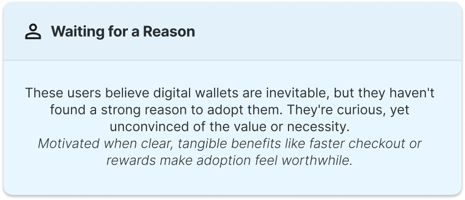

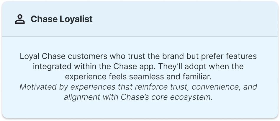


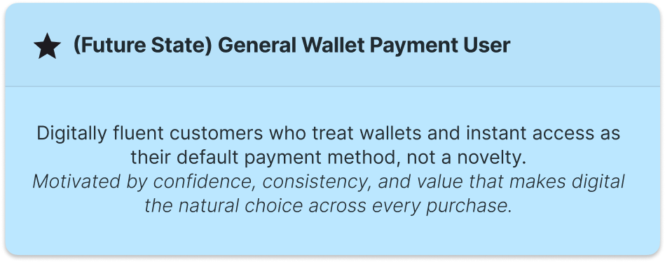
The Day Zero experience was designed to meet customers where they are, whether hesitant, curious, or loyal, and guide them toward greater digital confidence and engagement. By surfacing clear value, simplifying instant access, and reinforcing trust, the experience helps move users across archetypes toward the General Wallet Payment User mindset and builds lasting digital adoption over time.
User Journey
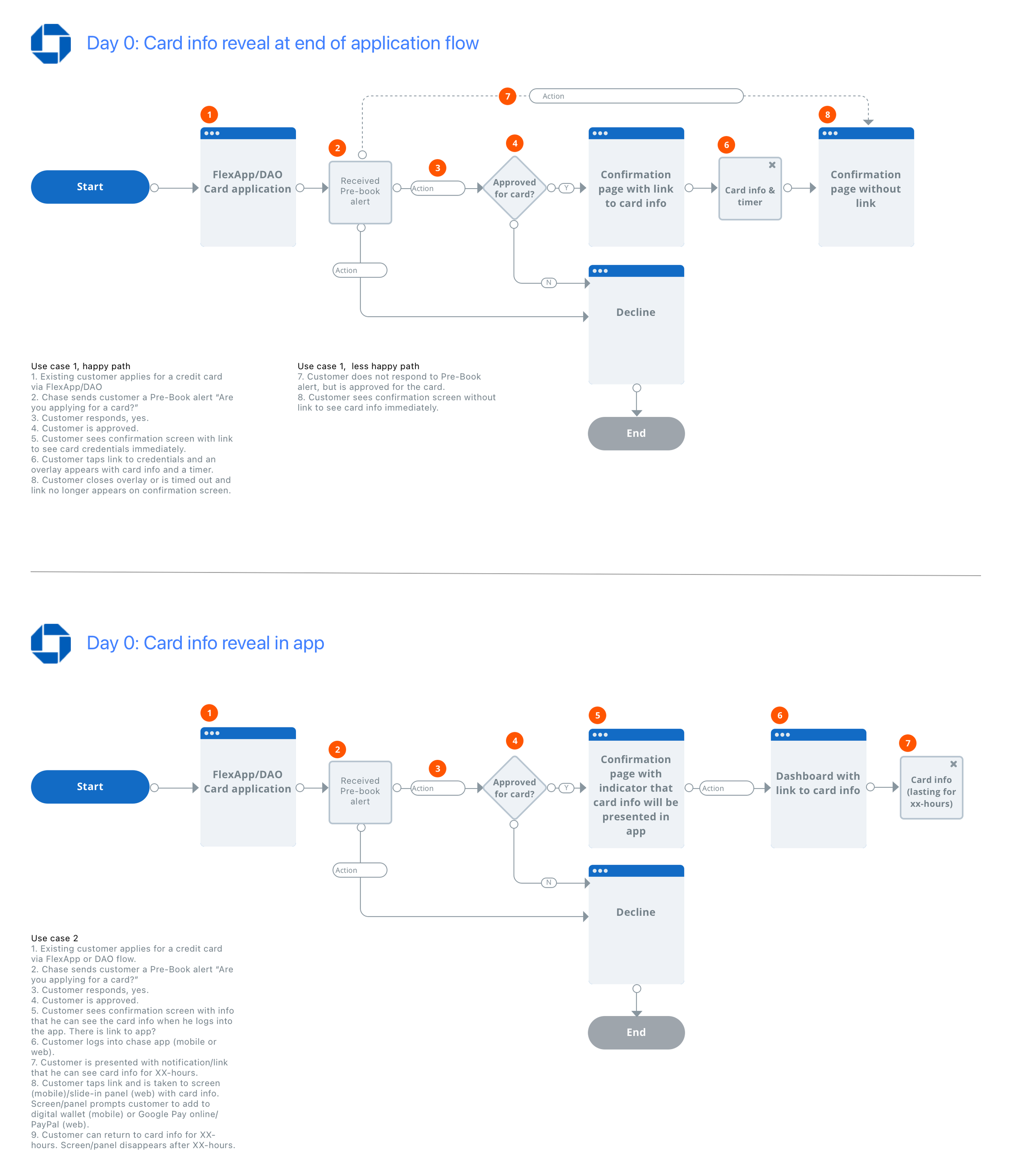
I facilitated a cross-functional kickoff with key stakeholders across engineering and product to align on goals, constraints, and areas of focus for the new Day Zero experience. Our objective was to understand how and where customers could best access their new card information immediately after approval, while ensuring the solution was both technically feasible and compliant.
From this discussion, the team identified two primary opportunities to reveal card details:
At the end of the application flow, allowing customers to view and use their card immediately upon approval
Within the app experience, giving customers the flexibility to retrieve their card details later through a secure entry point
To visualize these opportunities, I mapped out the end-to-end user journeys for both scenarios. This helped clarify the overall experience, aligning cross-functional partners on dependencies and pinpointing the exact stages where we could introduce the new card information reveal in a way that felt seamless, secure, and intuitive for customers.
Research and Insights
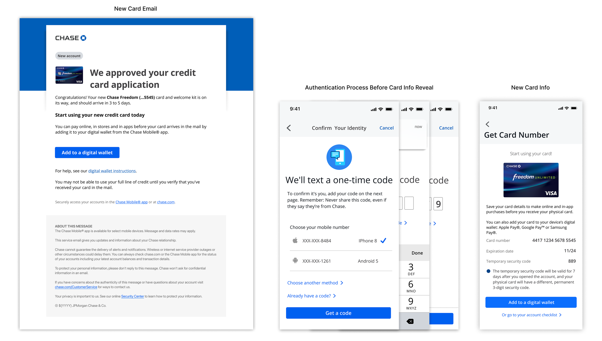
Before defining design directions, I conducted stakeholder interviews and a competitive analysis to align teams and uncover best practices for securely displaying new card information. Since this project impacted the Account Opening & Activation flow, I met with their team to confirm my understanding of the user experience and present ideas for introducing the new card design page, as identified by Product and Engineering. I also partnered with Legal to clarify what details could be safely displayed and reconnected with Product to confirm additional deliverables. In parallel, I analyzed competitor experiences to identify opportunities, constraints, and best practices that shaped our strategy for surfacing the card reveal within the Chase ecosystem.
Stakeholder Interview Findings:
Visibility & Placement: The Account Opening & Activation team wants to modernize the post-approval success screen, highlighting next steps and ensuring visibility into the new card experience.
Security & Compliance: The Legal and Risk teams emphasized the need for strong fraud protection, requiring authentication and clear time limits around when and how card details are displayed.
Omnichannel Strategy: Stakeholders recommended integrating the card reveal into both web and mobile experiences, supported by a welcome email introducing the option to add to digital wallets immediately after approval.
These conversations guided early design requirements and ensured every decision balanced user clarity, security, and regulatory compliance.
Competitive Analysis Findings:
To inform our approach, I evaluated leading financial institutions, including Bank of America, Capital One, and American Express, to understand common design patterns and opportunities to differentiate Chase’s experience. The key takeaways included:
Authentication Layer: Bank of America and Capital One require users to complete an additional verification step (a 6-digit code) before revealing new card credentials, thereby reinforcing trust and security.
Temporary Visibility: American Express utilizes a countdown timer to indicate when card information will be unavailable, thereby setting clear expectations around its availability.
Streamlined Display: All competitors display card details on a single page, combining the Primary Account Number (PAN), CVV, and expiration for immediate access and easy wallet provisioning.
These insights validated the importance of designing an experience that is secure, time-bound, and transparent, while maintaining Chase’s brand promise of trust and ease of use.
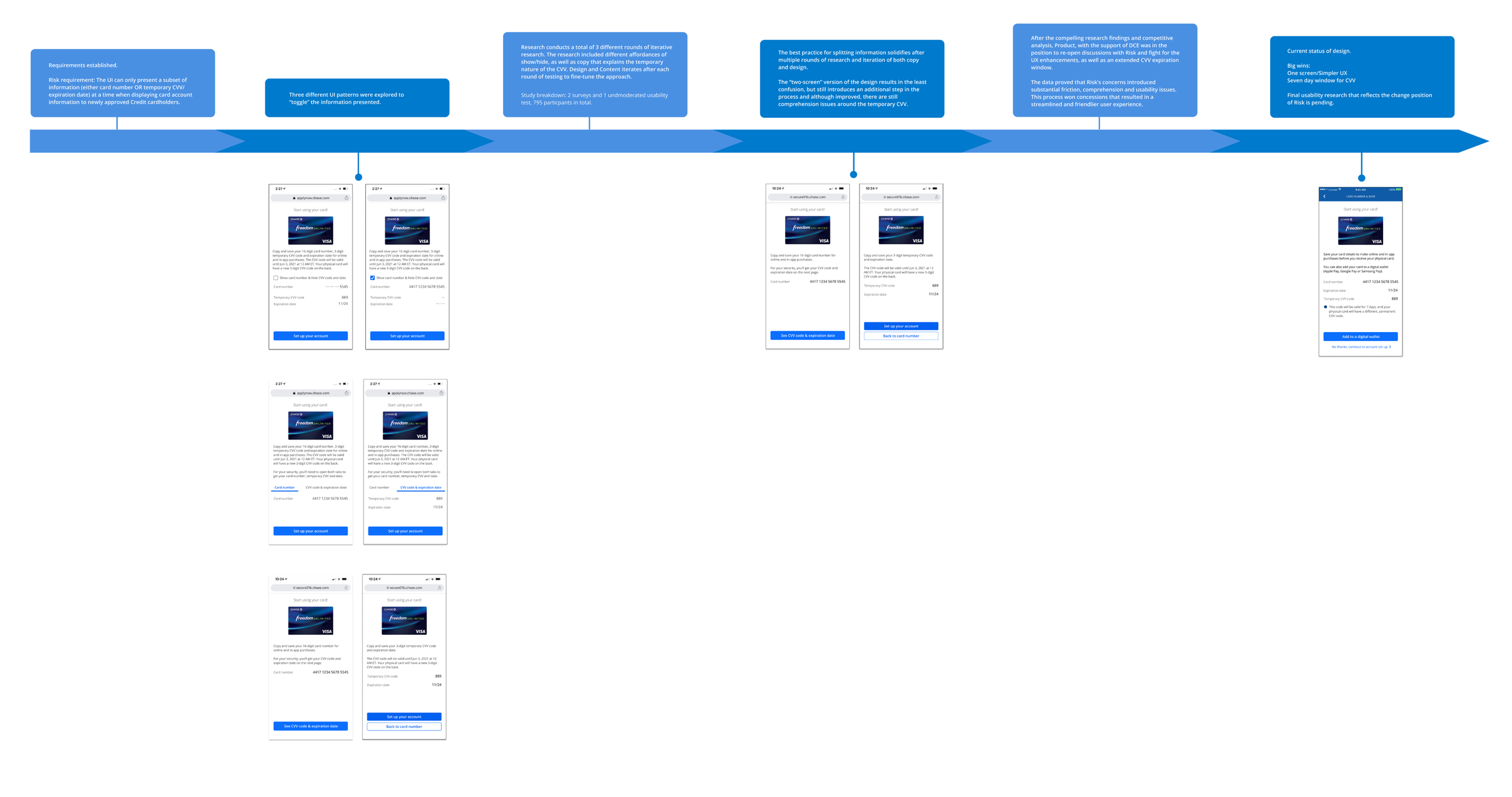
Validation & Iteration
Using the insights gathered from stakeholder interviews and competitive analysis, I explored several design variations to determine the best way to display new card information, balancing user needs, clarity, and legal compliance. Each concept aimed to build trust, reduce cognitive load, and address the legal team’s concerns around security and controlled visibility. We conducted usability testing with 8 participants to evaluate comprehension, trust, and ease of use across these different design variations.
Design Variations Explored:
Timer: Introduced a countdown element that automatically hides card details after a set period, reinforcing trust and emphasizing temporary visibility for added security.
Checkbox: Required users to actively acknowledge a security disclaimer before viewing card details, ensuring they understand the importance of safeguarding their information.
Tabs: Grouped information across labeled tabs (e.g., “View Card Details,” “Add to Wallet”) to organize actions and reduce visual clutter, while maintaining a clear hierarchy of steps.
Separate Pages: Split the reveal flow into multiple screens, providing focused context at each step and ensuring sensitive information is displayed only when necessary.
Each variation was tested for comprehension, trust, and usability, allowing us to evaluate which approach most effectively communicated security, provided clarity, and aligned with legal requirements.
Usability Testing Results:
The separate pages variation performed best, with 97% task completion, as users appreciated the guided step-by-step flow. However, most still expressed a preference for a single-screen layout for quicker access.
Only 25% of participants understood that the security code expires within 24 hours, indicating a need for clearer inline messaging and visual cues about temporary credentials.
Several participants were unclear about the “Set Up Your Account” action, often expecting it to help them add their card to a digital wallet. This revealed an opportunity to clarify language and align actions with user expectations.
Across all variations, users valued transparency and guidance when viewing sensitive information.
After sharing the research findings and usability results, the Legal team gained a deeper understanding of how customers interacted with different layouts and visibility patterns. Seeing how users struggled to complete tasks across multiple screens, they agreed to consolidate all new card information onto a single screen to reduce friction and improve clarity. They also approved extending the security code visibility window from 24 hours to 7 days, recognizing the need to find the right balance between security and a more practical and user-friendly experience. This alignment marked a significant milestone, ensuring the final solution met compliance standards while meaningfully improving usability and customer confidence.
Design Iterations

final Designs & Delivery
Once we converged on the design direction informed by usability testing and stakeholder alignment, I refined and polished high-fidelity mocks and interactive prototypes across web and mobile (iOS/Android) to reflect the final vision for Day Zero. The final designs feature a single-screen reveal for card information, inline clarity around credential expiration, and clear affordances to “add to wallet,” “copy for checkout,” and “view again later.”
To ensure a smooth handoff and execution, I worked closely with engineering, product, legal, and accessibility teams to:
Annotate screens with design specs, states, error handling, and edge flows
Validate security constraints, masking logic, and timeouts (e.g. the 7-day visibility window) with the legal and compliance teams
Collaborate on data flows and API requirements so the backend could support reveal, hide, and expiry behavior
Coordinate with the accessibility team to define screen reader labels, focus states, contrast, and keyboard interactivity for masked/unmasked toggles
Conduct design reviews with engineers early and weekly to surface any constraints or technical trade-offs
Package all final design assets (components, tokens, interactions) into Figma and organize for the build team with clear versioning and documentation
To support launch readiness, I also designed edge-case scenarios (expired credentials, network error, re-reveal flow) and created launch communication drafts (including emails) to help users understand what to expect and how Day Zero works.
Reflection & What’s Next
Designing Day Zero was a highly collaborative effort that brought together design, product, engineering, and legal to deliver an experience that balances security, clarity, and early activation. Through research, iteration, and partnership, we developed a solution that enables customers to start using their card instantly with confidence.
Key Reflections:
Partnering closely with Legal, Risk, and Account Opening & Activation ensured the final solution was both compliant and user-centric, bridging gaps between policy and experience.
Early user interviews, competitive benchmarking, and usability testing revealed pain points related to comprehension, timing, and visibility, which directly informed our final design choices.
Consolidating card details into a single, focused screen improved task completion and clarity, while setting new standards for how Chase introduces digital-first experiences.
Launch emails and contextual cues helped customers understand what to expect, when their credentials would expire, and how to proceed with their new card.
What’s Next:
Looking ahead, we see opportunities to strengthen trust and security further while streamlining the experience:
Explore integrating passkey authentication as an additional security layer before revealing card details, ensuring customers are verified in a frictionless, passwordless way.
Introduce real-time feedback and guidance to help users understand when and how credentials expire.
Expand metrics tracking to measure activation-to-spend conversion, wallet provisioning, and user retention over time.
Together, these next steps would evolve Day Zero into a more secure, intuitive, and scalable platform for future Chase digital experiences.