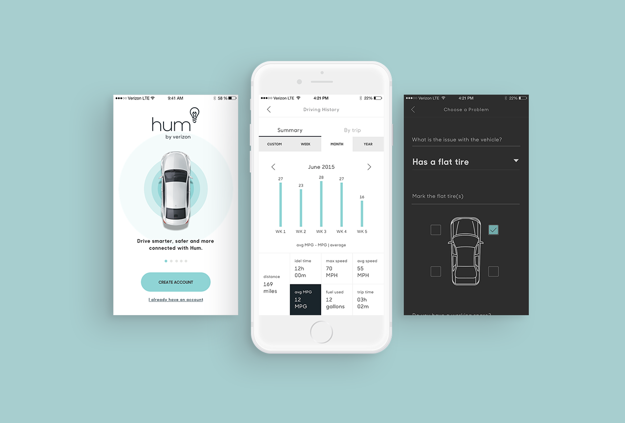
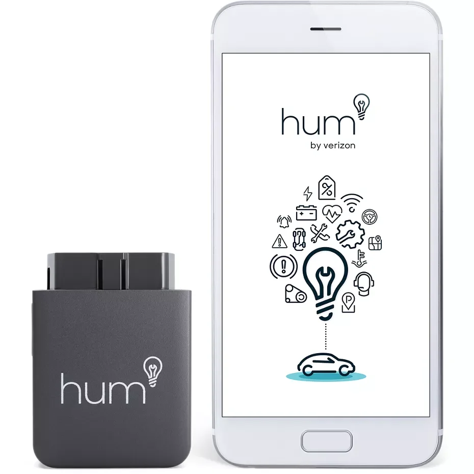
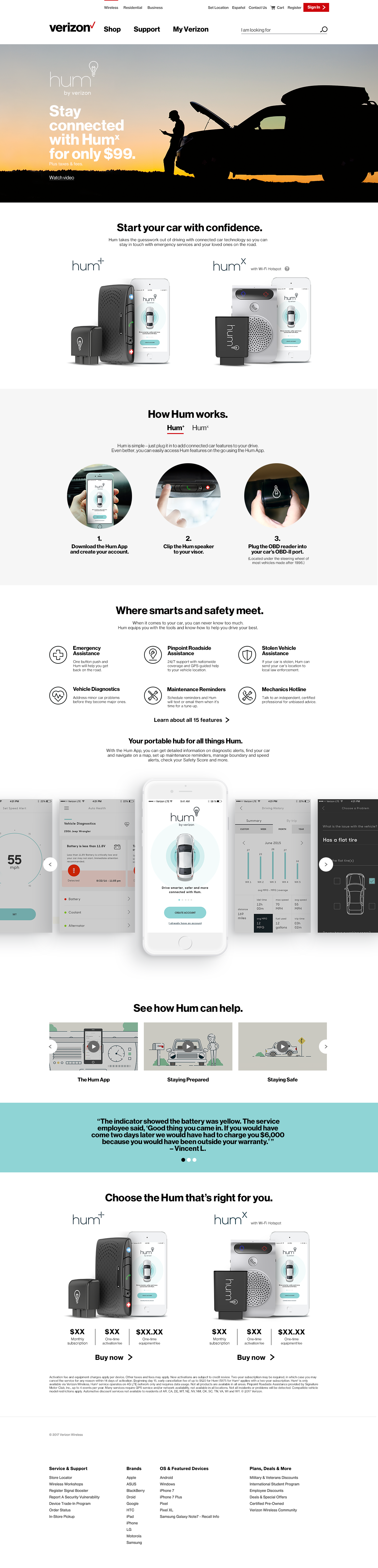
Verizon HUM Connected Car Experience
Connected Vehicle UX and Digital Product Platform • Launched Q2 2017The Verizon HUM product originally lived on a separate website, creating a disconnected experience from Verizon’s core digital ecosystem and making it harder for customers to understand what HUM was and how it fit within Verizon’s offerings. This project focused on integrating HUM into Verizon’s main site as a dedicated product page, delivering a full-page uplift to clearly explain the product and its value. Because HUM includes two distinct offerings, HUM-X and HUM+, the redesigned experience needs to clearly outline the differences between them to enable customers to easily compare options and confidently choose the solution that best fits their needs.
Role: Senior Product Designer
Stakeholders: Product Owner, Engineering, Content Strategist
Timeline: 3 months
Product Launch Date: Q2 2017
Platform: Desktop
The Problem
The HUM product, though a Verizon offering, currently resides on a separate website, leaving many customers unaware that it is part of Verizon’s ecosystem. More critically, the existing experience does not clearly explain what HUM is, how it works, or the differences between HUM-X and HUM+, leading to customer confusion and incorrect purchases. To resolve this, HUM needed to be integrated into Verizon’s official website, alongside a full product page uplift to improve clarity and transparency and help customers confidently choose the right product for their vehicle.
80%
Of online shoppers report the current HUM.com experience lacks clear product information, causing hesitation during purchase
72%
Of customers won’t take action until they clearly understand what HUM is and how HUM-X and HUM+ differ
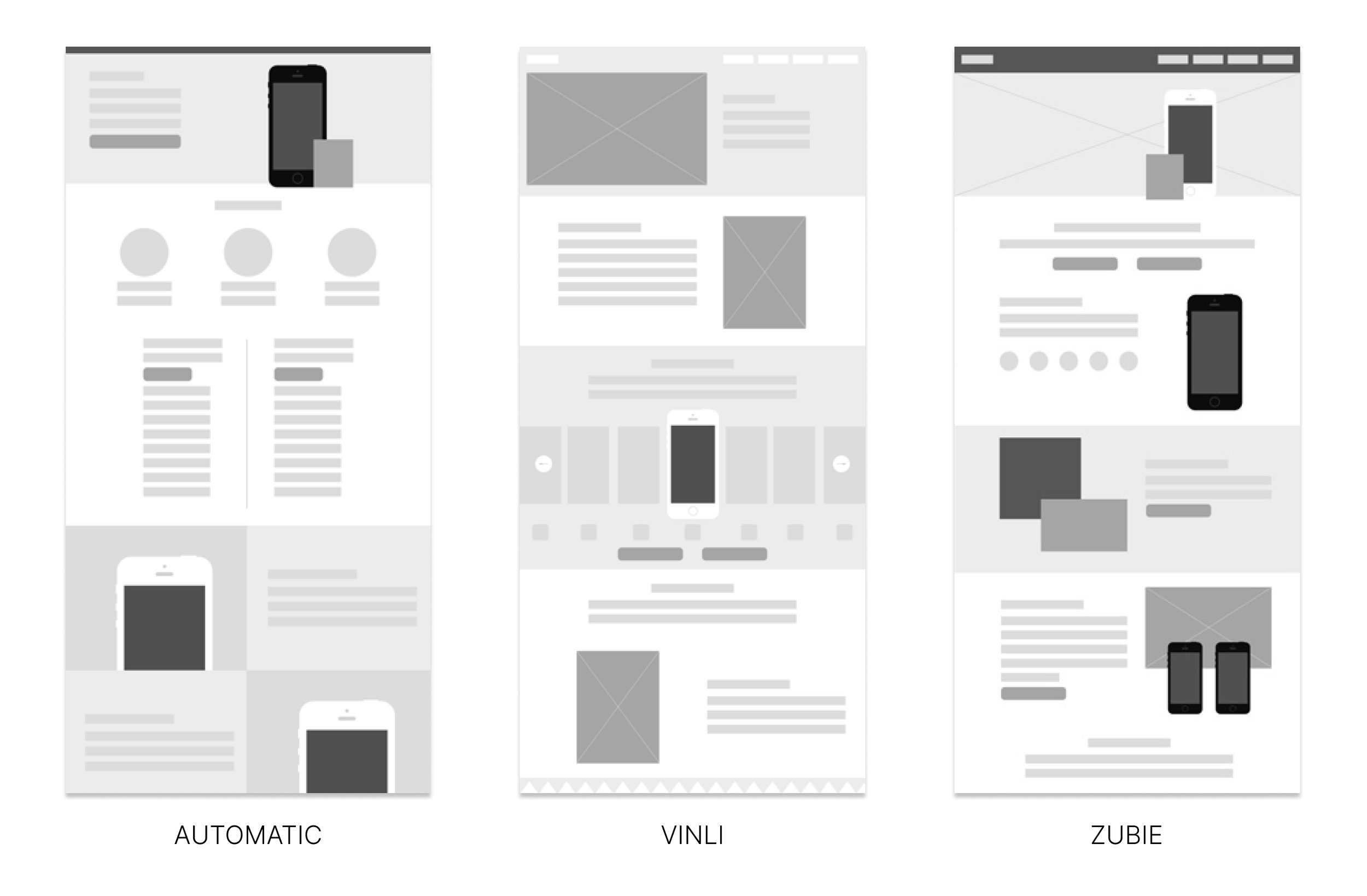
Comparative Layout Analysis
To identify HUM's new design opportunities while aligning with Verizon’s brand, I conducted a comparative layout analysis of our three competitors’ websites: Automatic, Vinli, and Zubie. We took inspiration from Automatic’s direct and clean messaging strategy and Vinli’s visually engaging content, particularly their app's compelling storytelling, to breathe life into our site designs.
Understanding Our Users
We grounded this project in existing user research conducted by Verizon’s research team on the original HUM website. Reviewing these findings helped us understand how customers evaluate car diagnostic adapters, what information they prioritize, and where confusion occurs during the purchase journey. Research patterns showed that users struggled to understand the product without videos and found it difficult to differentiate among similar offerings, often requesting clear, side-by-side comparisons. These insights informed the creation of three core user personas and reinforced the need for clearer information hierarchy, transparent product explanations, and a mobile-friendly comparison experience that helps customers confidently choose the right HUM product.
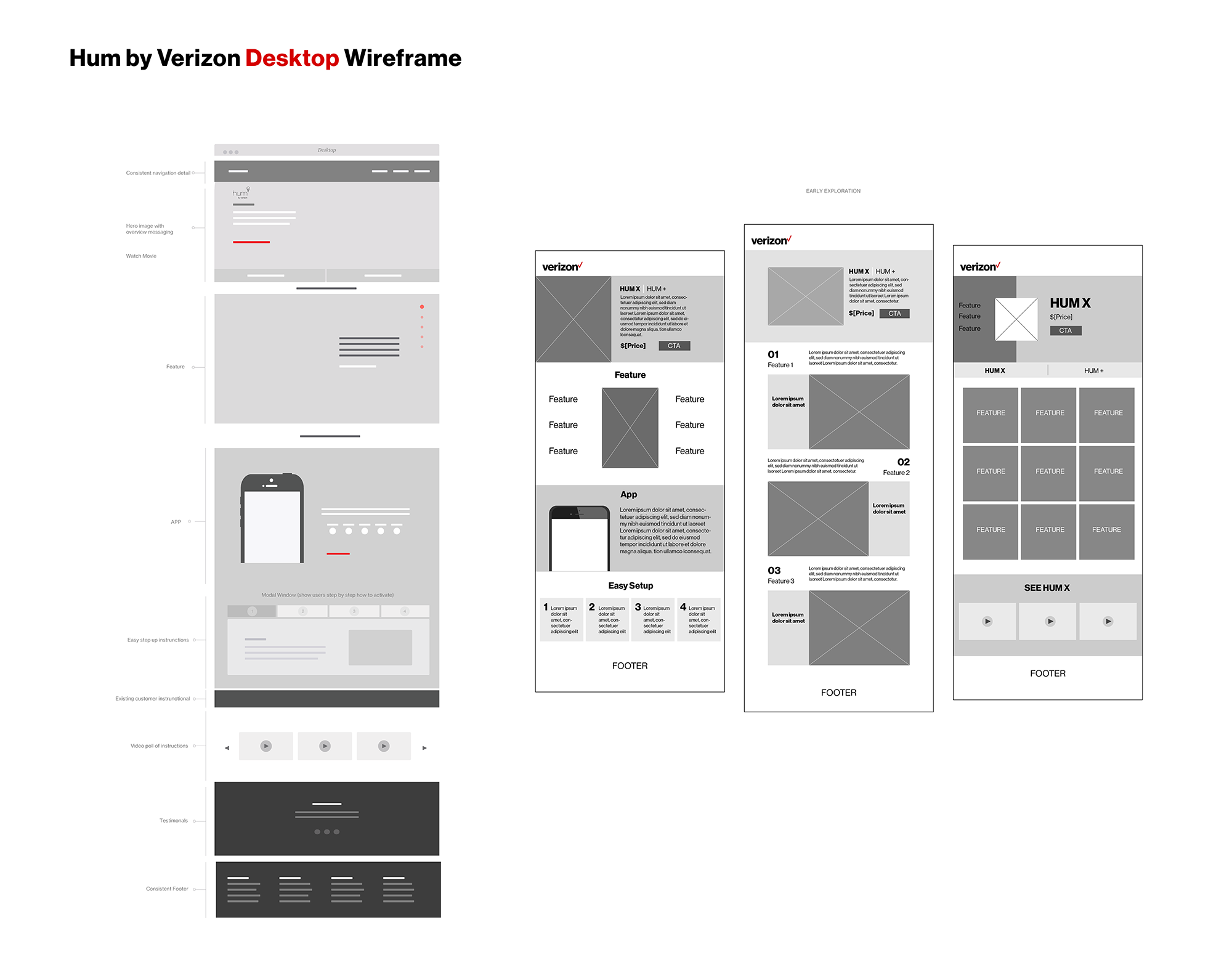
Design Explorations
Following a collaborative design studio, I translated early concepts into web and mobile wireframes and interactive prototypes to support usability testing. Early testing revealed confusion around how users accessed and compared information when HUM+ and HUM-X were presented on the same page, creating friction in decision-making.
To address this, I led an iteration that consolidated 15+ product features into a prioritized, accordion-based layout across both platforms, reducing cognitive load and improving scannability. This refinement enabled users to more easily scan, compare, and explore features at their own pace, resulting in higher engagement, clearer product understanding, and more confident product selection.
HUM’s Official New Product Page
Launch and Impact (Q2 2017)
The redesigned HUM product page launched in 2017 as part of Verizon’s official website, bringing the previously standalone experience into Verizon’s core ecosystem and improving product visibility and trust. Following launch, HUM saw strong early traction, generating 10,000 pre-orders within the first week and reaching 100M+ digital impressions through Verizon’s marketing and web presence. HUM’s lineup, which included HUM+ and HUM-X, increased exposure and reinforced the importance of a clear, transparent product page that accurately explained the product, differentiated offerings, and supported confident customer decision-making at scale.