Redesigning How Patients Find Their Way to Care
Healthcare: Patient ExperienceNewYork-Presbyterian's public brochure was originally created as marketing material to promote the system's leading medical centers across the five boroughs. Over time, patients and their families started relying on it for something else entirely: finding their way to a hospital. The brochure was never built for that job. It was text-heavy, organized like a pitch rather than a reference, and the medical center locations were reduced to small map pins that gave no sense of what the buildings actually looked like.
The Public Relations team asked me to redesign it with that real use in mind: reprioritize the information so people could find what they needed, keep NewYork-Presbyterian's branding intact, and retain the required Facts & Financials data. I led the research and design end-to-end, from talking to people in a hospital lobby to the final print layout.
Role: Lead Visual Designer
Stakeholders: Product Owner, Content Strategist
Timeline: 1 month
Platform: Print media
The Problem
NewYork-Presbyterian's one-page brochure was originally created as marketing material to promote the system's leading medical centers across the five boroughs.
Over time, its job changed. Patients and their families started using it to find their way to a hospital, but the page was still dense with paragraph text, built for scanning a pitch, not for finding an address under pressure. The Public Relations team brought it to me to reprioritize the information architecture and add visuals that would actually help readers find what they needed, while keeping NewYork-Presbyterian's branding intact and retaining the required Facts & Financials data.
Understanding The Customer
Rather than redesigning from assumptions, I took the brochure into the field and spoke with people in the lobby of Columbia University Irving Medical Center, the exact moment and place someone would reach for it. I wanted to understand who was really using this page, what they were looking for, and where they got stuck.
What people skipped:
Most visitors skipped over the Facts & Financials section entirely. It read as internal reporting, not something meant for them.
What people wanted more of:
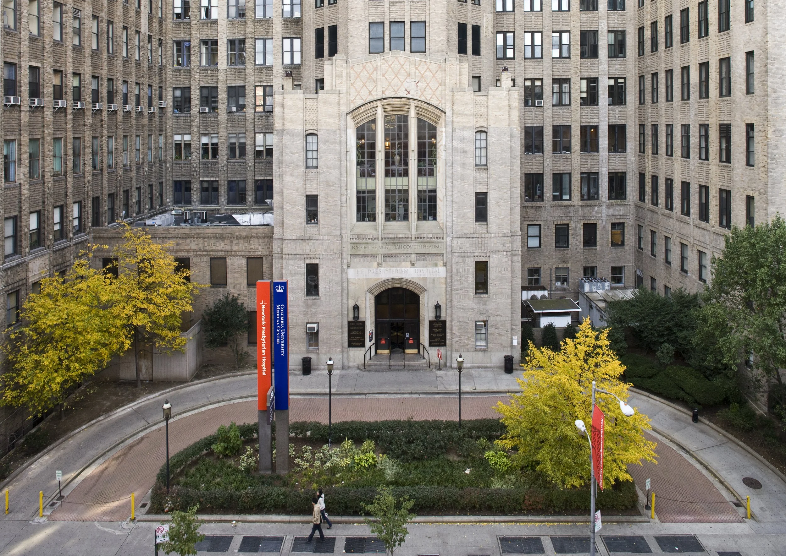
Several mentioned that when they look up an address on Google, they take the extra step of finding a photo of the building. It's how they confirm they've arrived at the right place.
Reordering the Information Hierarchy
The research made the must-haves clear: medical center locations needed to be easy to find, and building photos would do more for wayfinding than a map pin alone. Facts & Financials still had to stay, so instead of leading with it, I moved it later and gave the numbers themselves more visual weight, bold against regular text, so the section earned a glance even from someone who'd normally skip it.
I also gave the layout more room to work with by using both the front and back of the page, rather than compressing everything onto one side. That freed up space for a real photo of each medical center, so someone walking up to a building could match it to the page in hand.
Original
Redesign
Staying Inside the Brand System
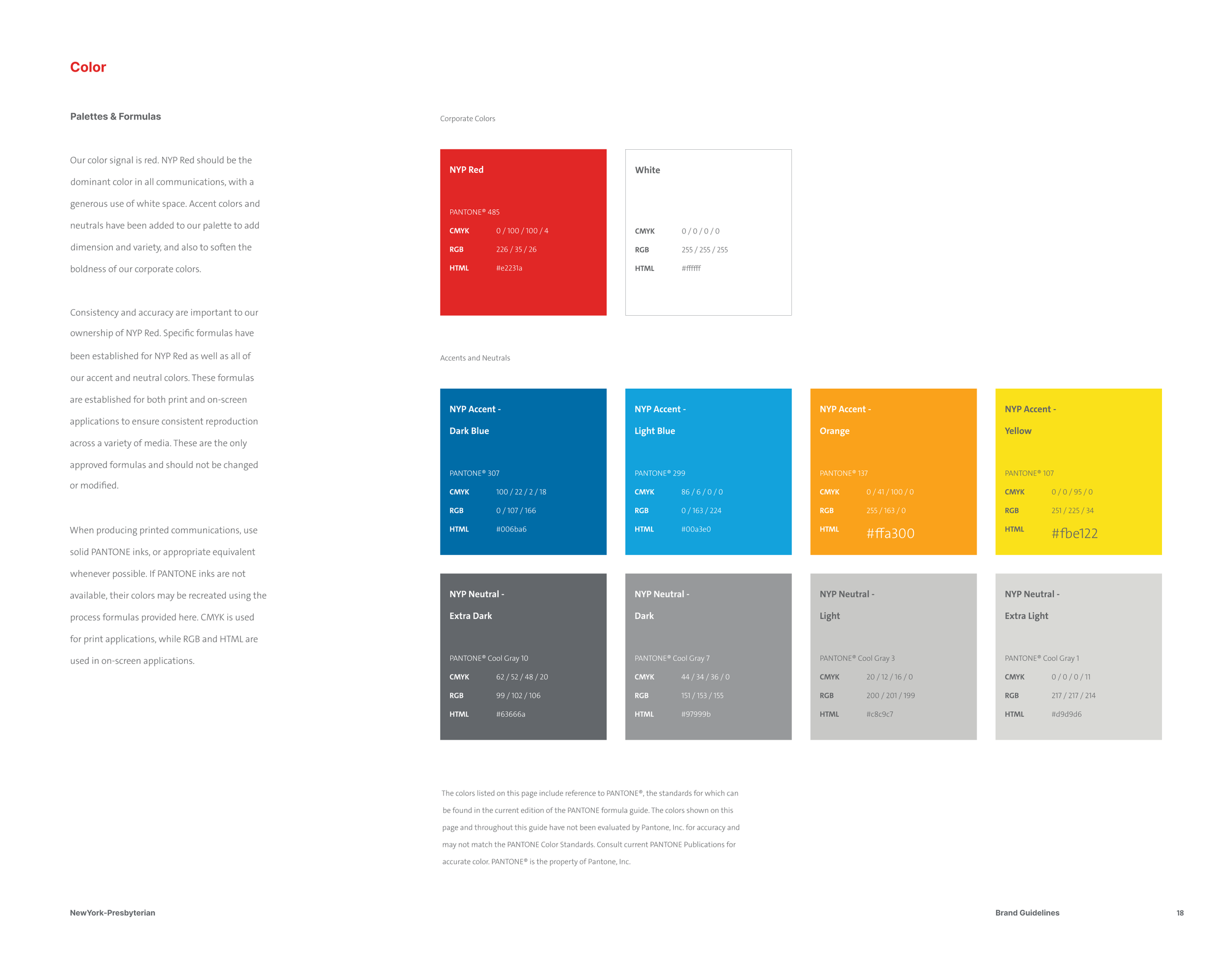
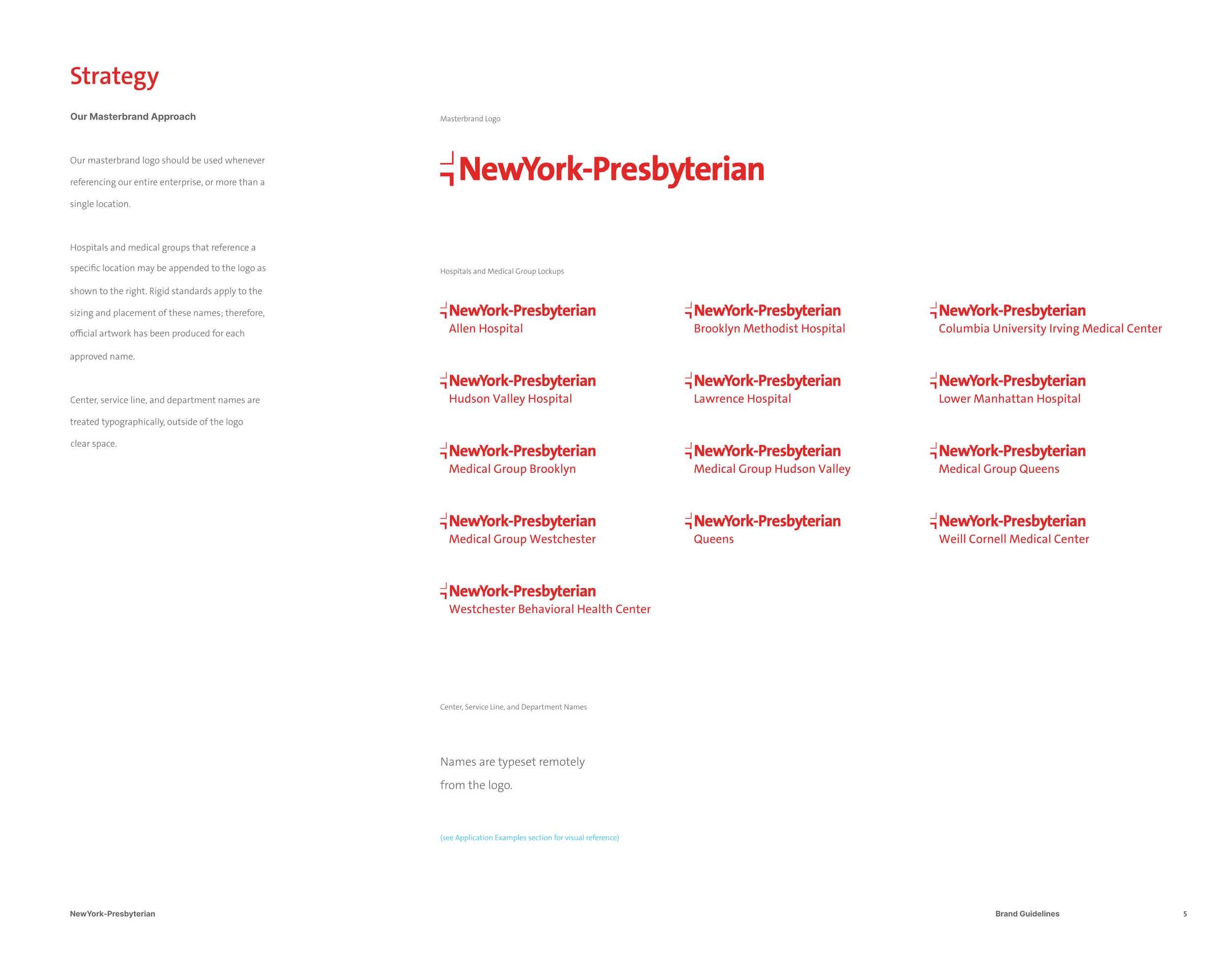
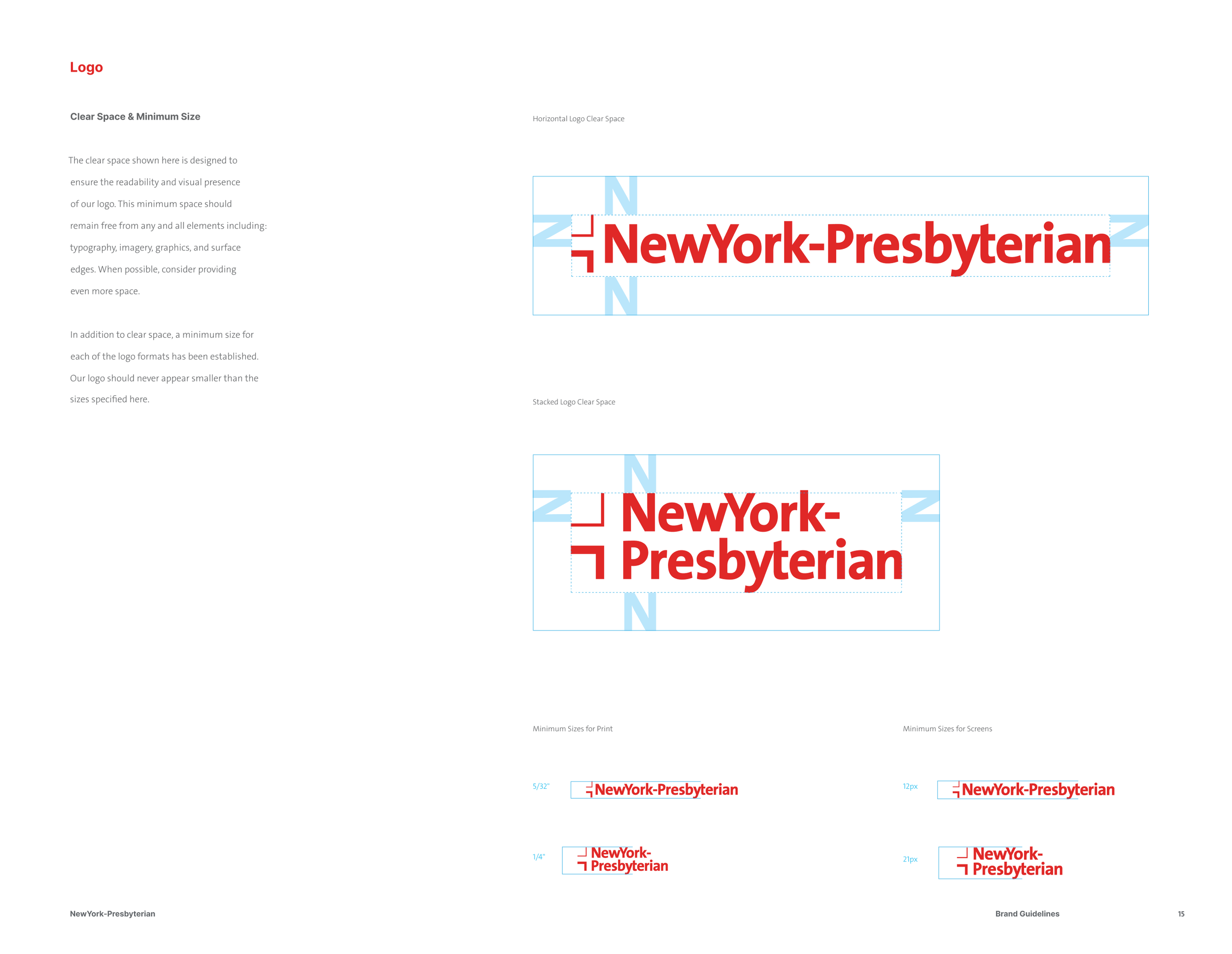
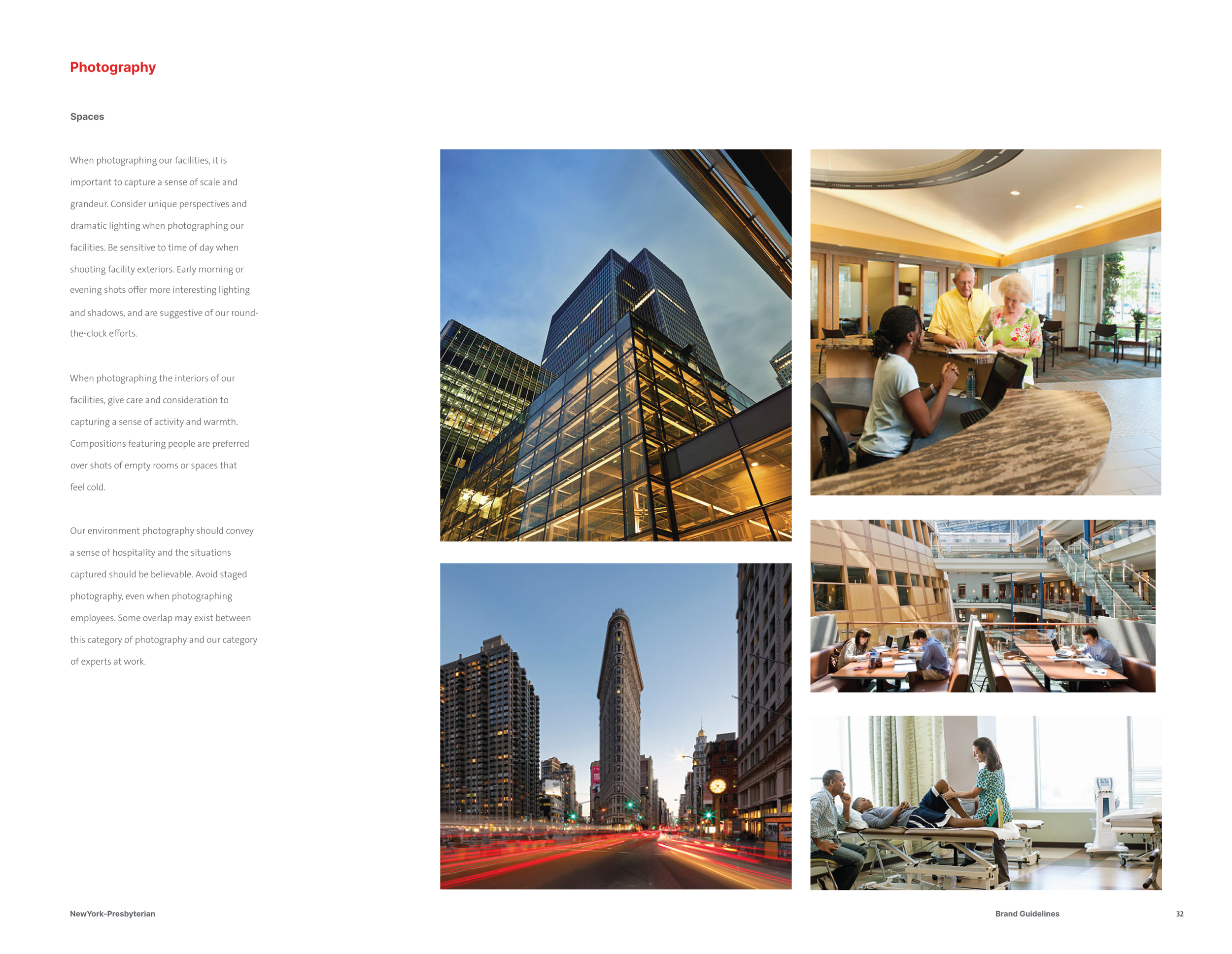
Reorganizing the page didn't mean I had a license to redesign NewYork-Presbyterian's visual identity. I worked from their brand guidelines throughout, referencing their approved color palette (NYP Red as the dominant signal color, with a defined set of accent and neutral tones) and their photography standards for how buildings and people should be represented across collateral. Every layout decision, from where red appears to how much white space surrounds it, stayed inside those rules.
Designed for the Moment of Use
The brochure kept every piece of information the PR team needed, but it no longer asked readers to fight through paragraphs to find a hospital. Someone using it to find NewYork-Presbyterian Queens, say, can now confirm they've reached the right building because they've already seen a photo of it, the same extra step people told me they were taking on Google, just already done for them.
Beyond the Brochure
Talking to people in the lobby, rather than guessing from a desk, shaped this redesign. That's why Facts & Financials moved instead of getting cut, and why building photos became a priority instead of a nice-to-have. Watching someone hold a brochure while looking for a building taught me more in an afternoon than any amount of internal feedback could have.
That instinct is also what makes me want to keep going. A brochure is one touchpoint in a much longer path someone takes to find care, and if I had more time on this project, I would have followed that path further, starting with NewYork-Presbyterian's own website. The same people flipping through this brochure in a lobby are likely searching for the same locations online first, and I'd want to know whether that digital experience gives them the same clarity the redesigned print piece now does.
That's the instinct I bring to any project handed to me: not just solving the brief as given, but looking at where it sits in someone's larger journey, and asking what else needs to change for the piece in front of me to actually work.