Enabling Instant Card Access to New Card Spending
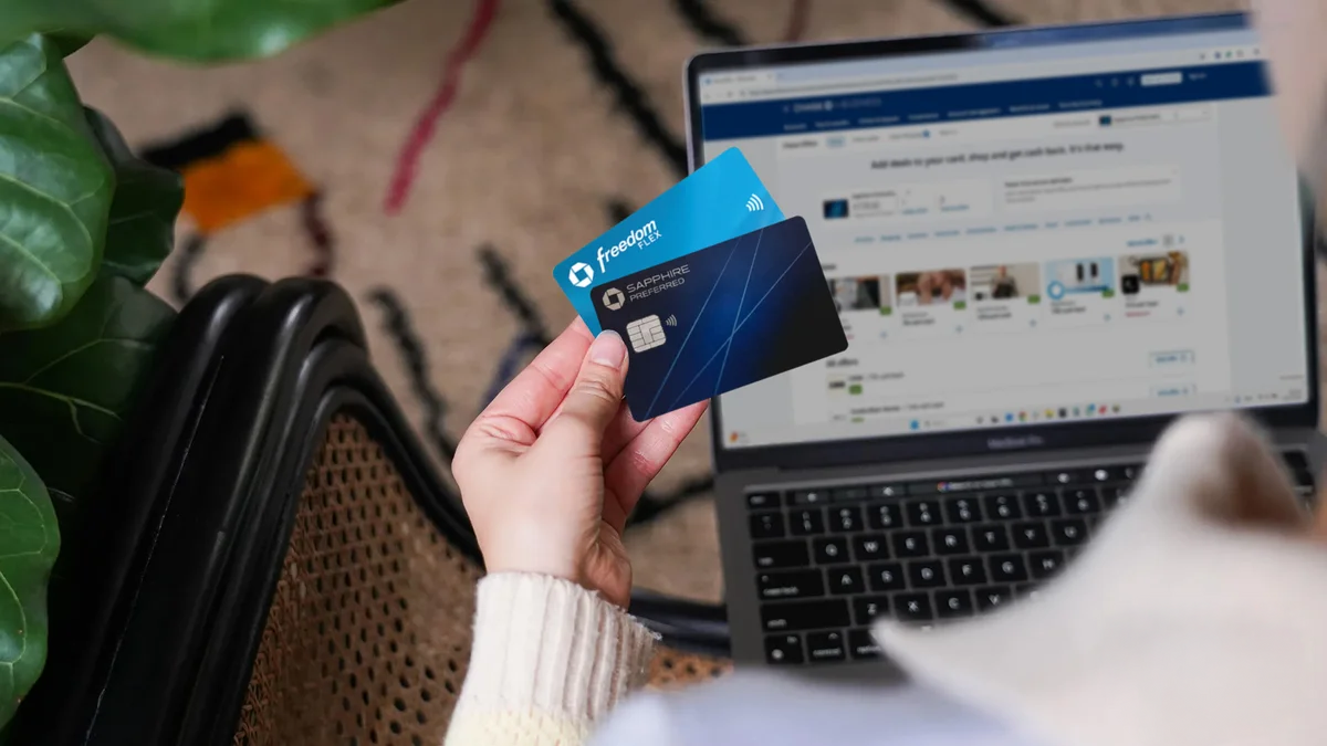
Consumer Financial Services Platform • Launched Q3 2019When Chase introduced Day Zero, it redefined the new cardholder experience by enabling immediate card access upon approval. As this capability expanded to e-commerce purchases, I led the design of a new feature that balanced simplicity, security, and confidence, empowering customers to start using their card right away. Launched in Q3 2019, this experience now supports over 10 million customers worldwide.
Role: Lead Product Designer
Stakeholders: Product Owner, Engineering, Cards Team, Risk and Security Team, Content Strategist
Timeline: 6 months
Product Launch Date: Q3 2019
Platform: Mobile (iOS & Android)
The Opportunity
Data analysis revealed a critical drop-off in the new-card journey. Although approximately 75% of approved customers proceeded to “Set Up Your Account,” many disengaged upon arrival because they could not access card details until their physical card arrived 7–10 days later. This gap between customer intent and system capabilities created a clear opportunity to enable instant card access, drive faster card activation and early spending while reducing Help Desk call volume.
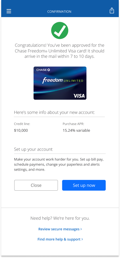
Current Card Application Design
In the existing card application flow, once a customer’s application is approved, they land on a congratulations page displaying high-level details such as their credit line and purchase APR. However, the experience falls short of supporting their next immediate need, leading to confusion and frustration.
Key gaps in the experience:
No access to card details or digital wallet setup after approval, blocking immediate use.
“Set Up Now” leads to a dead end, failing to deliver meaningful next steps.
High customer intent is met with friction, resulting in frustration and disappointment.
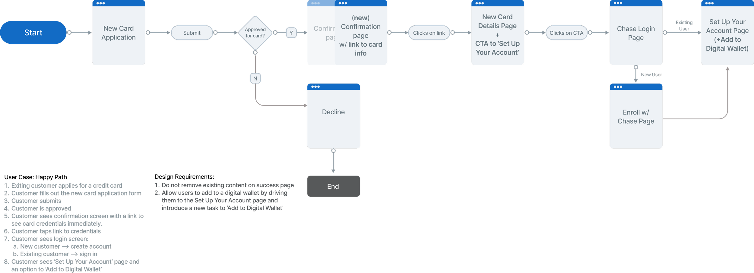
Card Application User Journey
I partnered closely with the Cards team to review the end-to-end user journey and identify the most natural moment to introduce this new capability. We aligned on the Confirmation page as the optimal entry point and defined two key design requirements:
Preserve existing content on the Confirmation page while extending it with a clear CTA that routes users to their new card details.
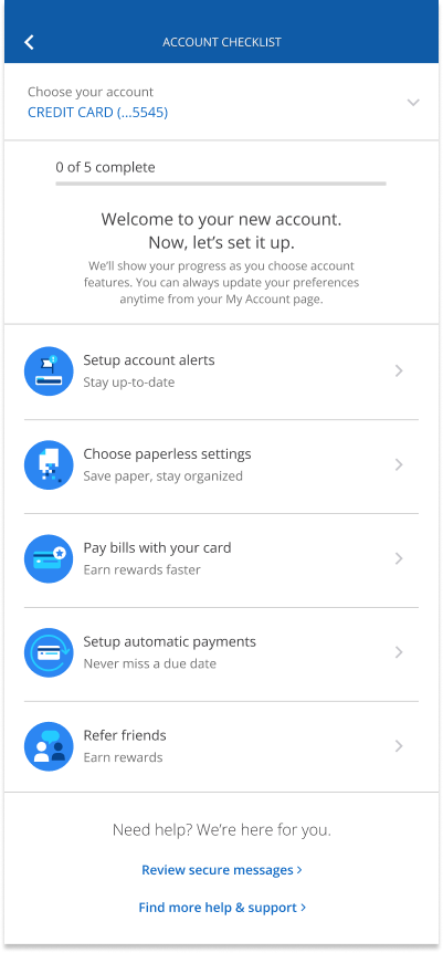
Leverage the Set Up Your Account page as the primary entry point for adding the card to a digital wallet.
Learning from the Market and Our Customers
Before exploring solutions, I reviewed how three leading banks present new card details and enable instant use, and partnered with research to survey recent applicants about their expectations after approval and how they would want to start using their card immediately. These insights helped shape a clear design direction rooted in real user needs and proven patterns.
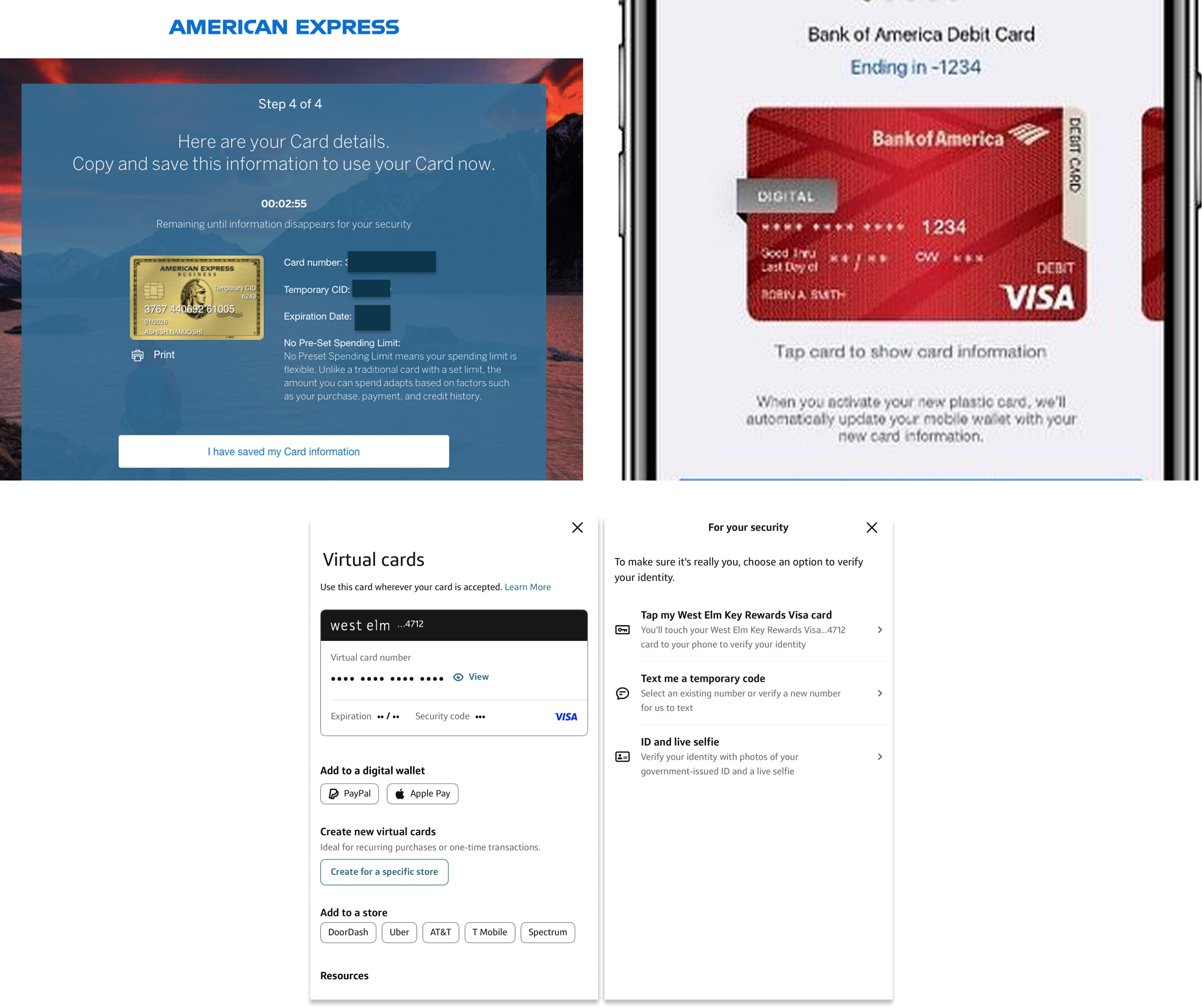
Key findings from competitive analysis:
American Express: Uses a time-based reveal of card details, which resonated with stakeholders for its clarity and perceived security. We aligned to test this approach, noting the tradeoff that expiring details limit digital wallet support.
Security constraints: Risk and Security defined two key requirements: staged disclosure of card details and a three-day expiration window for security codes.
Bank of America & Capital One: Both require identity verification before revealing card details, reinforcing trust and security. We aligned to incorporate a similar step.
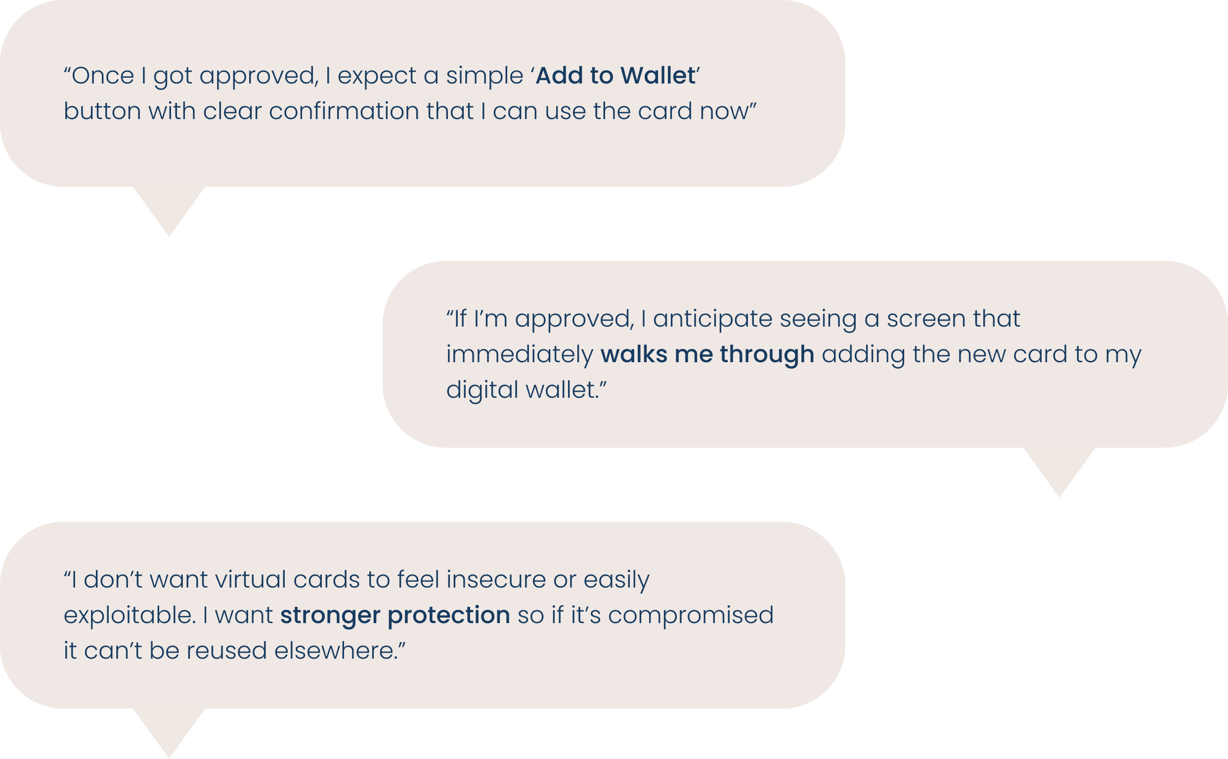
Key findings from qualitative research with recent cardholders:
Users want a simple, prominent “Add to Wallet” action upon approval, with clear confirmation that they can start using their card right away.
Users expect the experience to proactively walk them through adding their new card to their digital wallet, removing guesswork and friction.
While excited about instant use, users want strong protection and safeguards to ensure virtual cards feel secure and cannot be easily compromised or reused.
Design Requirements
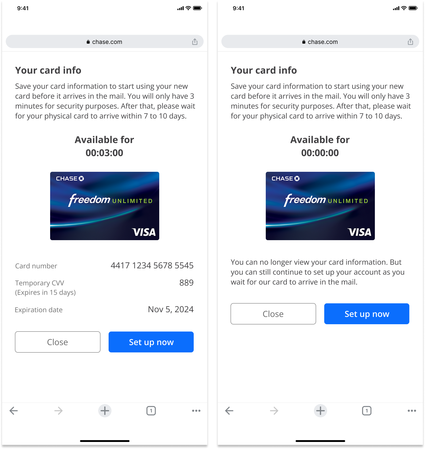
Display Card Info Separately: The new card information must be revealed in stages rather than displayed all at once.
Security Code Expires in 3 Days: The security code expires in 3 days, after which customers must wait for the physical card to arrive.
Extend the Success Page: Add an entry point on the success page for customers to access their new card information.
Set up your account as Entry Point: Use the ‘Set Up Your Account’ page as a natural entry point for digital wallet setup.
Cross-Platform Consistency: Ensure customers have a clear and seamless experience regardless of device or platform.
Design System: Prioritize existing components to reduce engineering lift and maintain consistency.
Design Explorations
With these insights, I explored multiple ways to surface new card details, ranging from modal-based interactions to full-page experiences, ultimately converging on a full-page layout with staged disclosure using design system components, resulting in four design approaches taken into user testing.
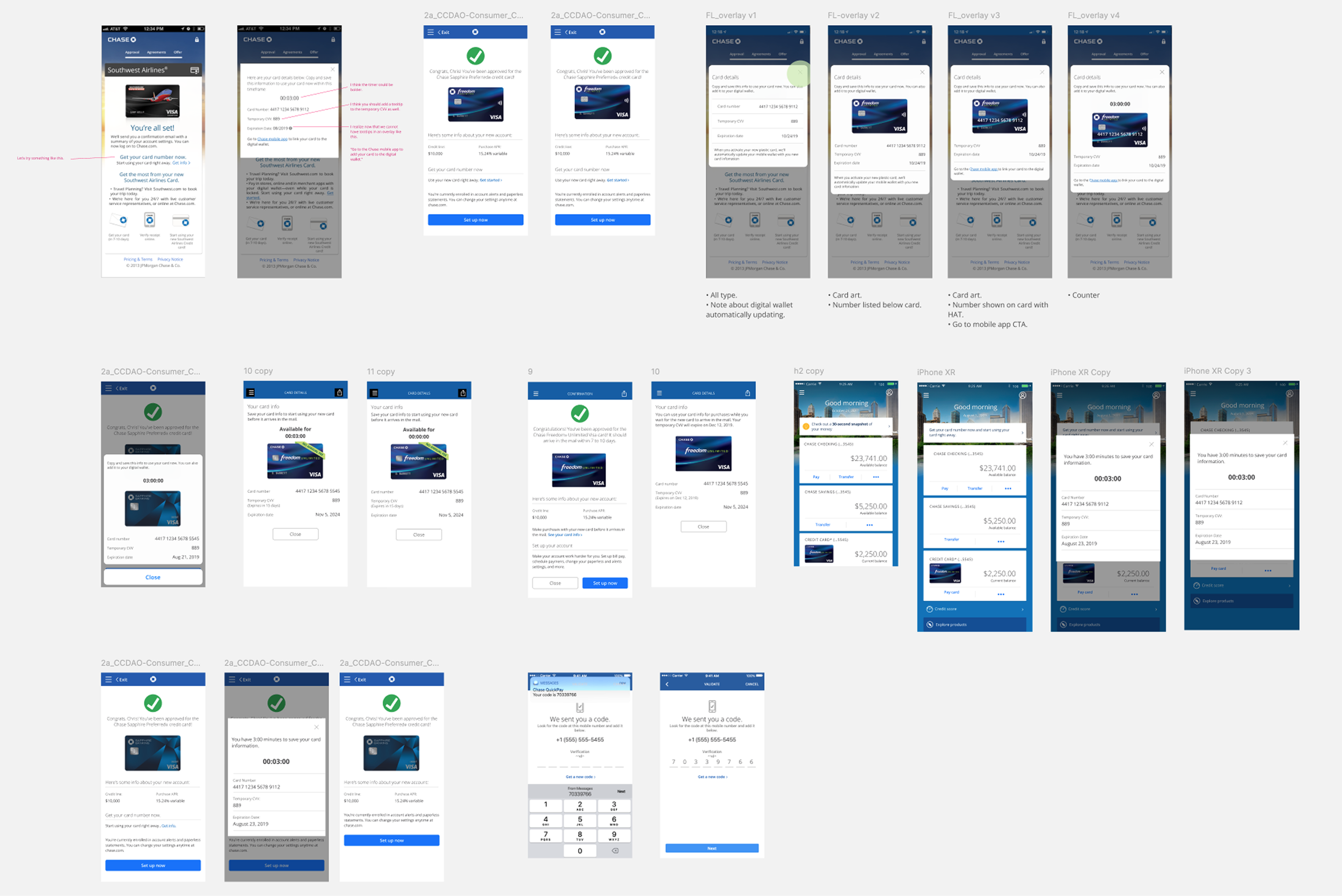
Approach #1: Timer
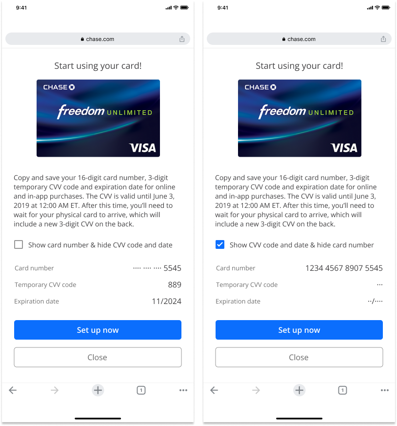
Approach #2: Checkbox
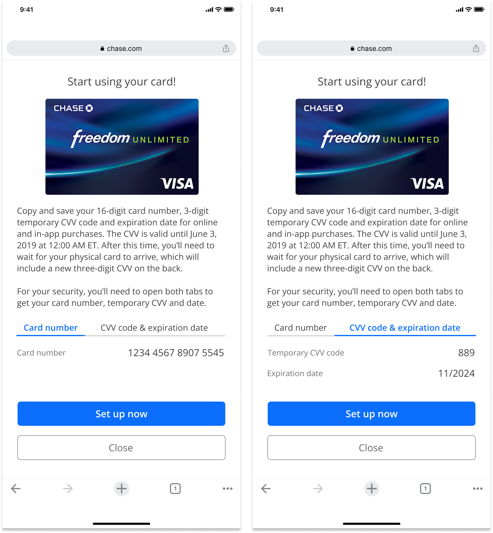
Approach #3: Tabs
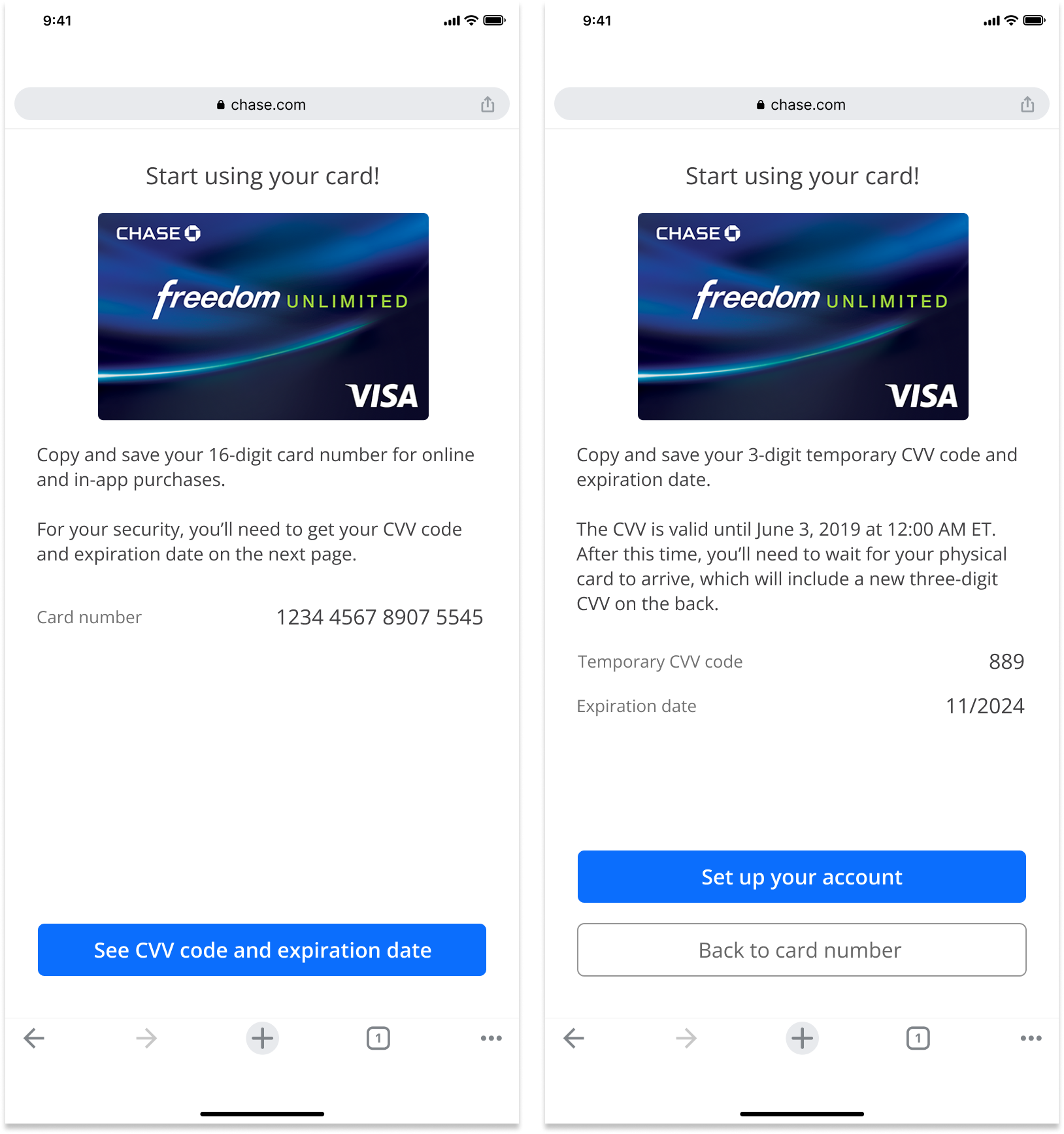
Approach #4: Separate Pages
User Validation
I created four interactive prototypes to A/B test different design approaches, evaluating which experience best supported users across the full journey, from approval confirmation and verification to viewing card details and adding the card to their digital wallet.
12/12
Did not like the timer
9/12
Missed the CVV 3 days expiration
11/12
Wanted to add to the digital wallet but the CTA was not clear enough
10/12
Preferred a single page display and did not understand why the details had to be separated
Final Designs
I presented the usability findings to both the Cards and Risk & Security teams, leading to key experience and policy updates:
Risk & Security aligned to extend the security code expiration from 3 to 7 days, matching typical card delivery timelines and reducing user friction.
The team also agreed to display all new card information on a single page to improve clarity and reduce cognitive load.
The Cards team approved changing the primary action from “Set Up Now” to “Add to Digital Wallet,” routing users directly to wallet setup while preserving the existing entry point on the Set Up Your Account page.
Launch and Impact (Q3 2019)
Chase launched ‘Spend Instantly’ in Q3 2019, giving newly approved customers immediate access to their card information so customers could start spending before the physical card arrives. In the first 3 months since launch, we saw:
64%
User successfully accessed and understood how to use their card instantly after approval
52%
Increase in digital wallet adds (Apple/Google/Samsung Pay) during card activation
41%
Reduction in customer confusion around temporary card information and expiration timing