American Express Plenti Rewards Experience
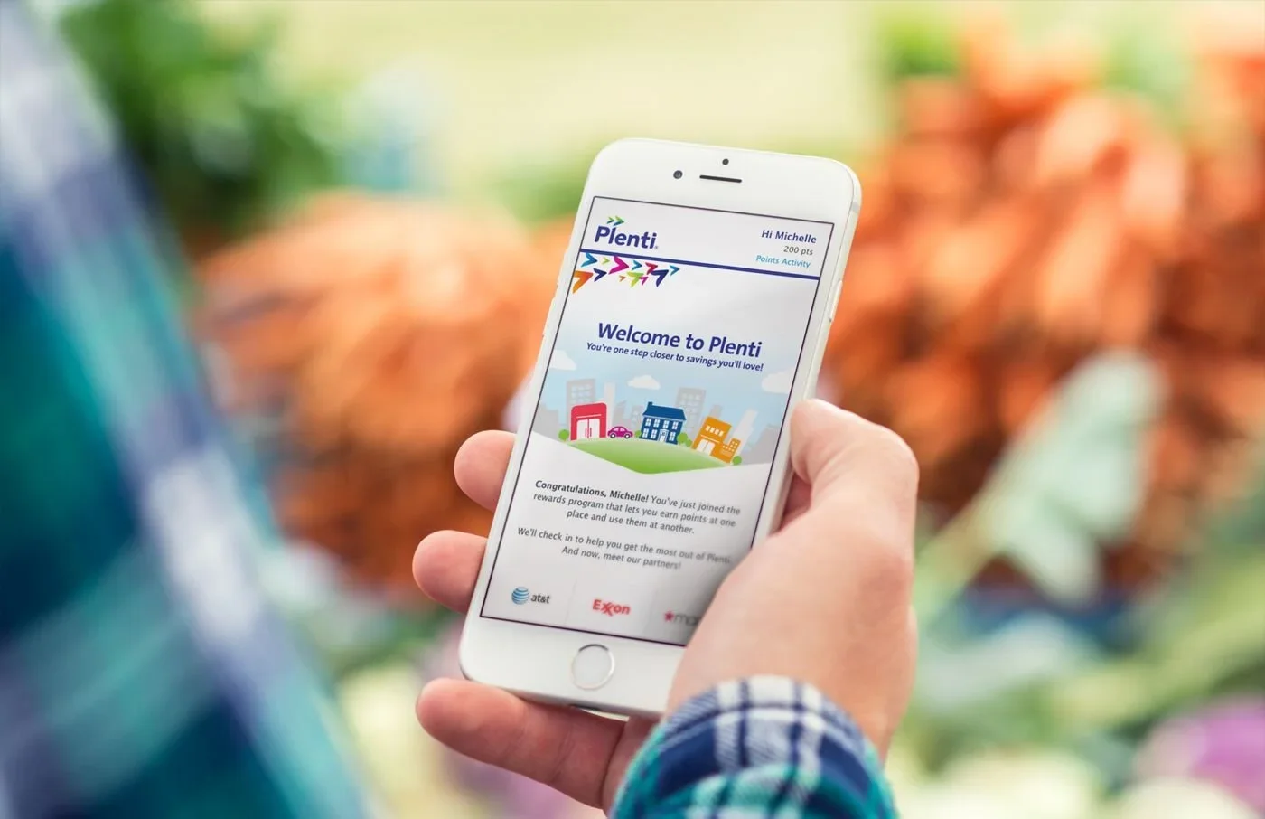
Consumer Financial Services and Rewards Platform • Launched Q3 2016Plenti was introduced as a coalition loyalty program designed to help customers earn and redeem rewards across multiple brands, but its value was often obscured by unclear point displays and dense offer layouts. In this project, I redesigned how reward points were displayed to make balances, earnings, and redemptions easier to understand at a glance. I also reworked the offer tiles and reshaped the information hierarchy across web and mobile, helping customers more quickly scan, compare, and act on relevant offers. The result was a clearer, more intuitive rewards experience that reduced cognitive load and improved engagement with Plenti’s loyalty ecosystem.
Role: Senior Product Designer
Stakeholders: Product Owner, Engineering, Content Strategist
Timeline: 5 months
Product Launch Date: Q3 2016
Platform: Desktop
The Problem
Despite Plenti’s promise to streamline rewards by combining points from hundreds of retailers into a single program, many users found the experience confusing and difficult to use. Customers struggled to understand how Plenti differed from their existing loyalty programs, how to track their points, and the value of their rewards, resulting in low engagement and frustration.
This lack of clarity wasn’t just a usability issue; it also had a measurable impact on overall platform engagement:
<50%
Of Plenti members redeemed their earned rewards, signaling confusion around point value and how to take action within the program
65%
Of Plenti members cited that they don’t clearly understand how to use their rewards
Understanding The Customer
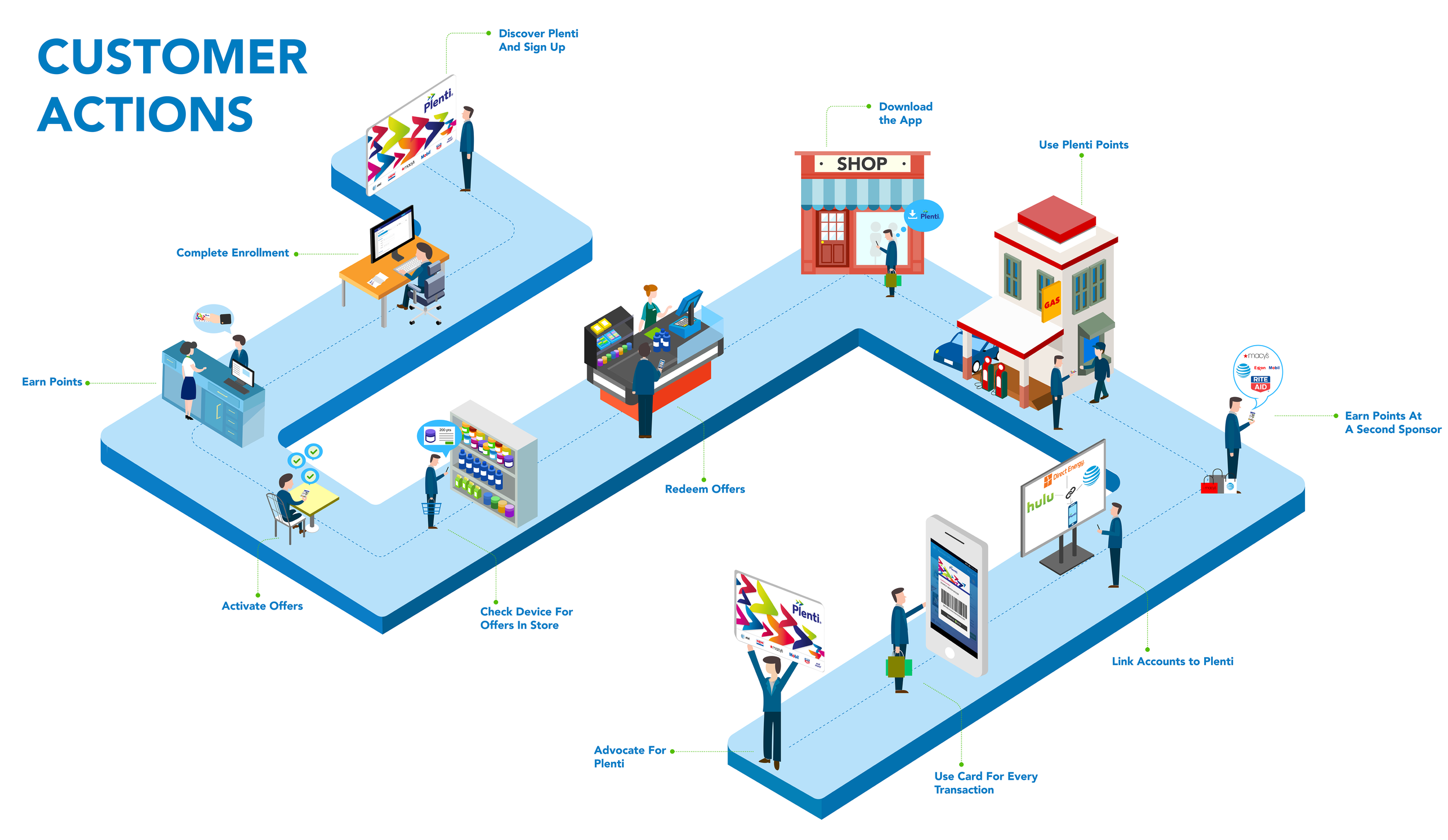
Building on prior usability research, I mapped an end-to-end customer journey to clearly illustrate the happy path and develop a stronger understanding of how that experience unfolds from start to finish.
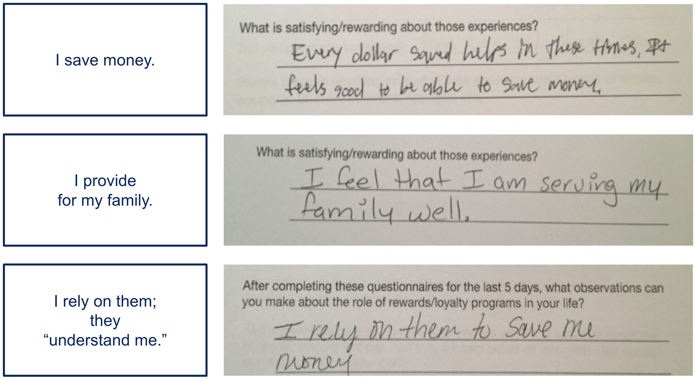
To deepen understanding of customer behaviors and expectations, I revisited a September 2013 usability study involving 12 active loyalty program users. Participants tracked their shopping habits prior to testing, allowing us to examine not only how Plenti was used but also how rewards programs fit into their everyday decision-making. The research revealed a set of recurring “little wins” that shaped how participants valued and trusted loyalty programs:
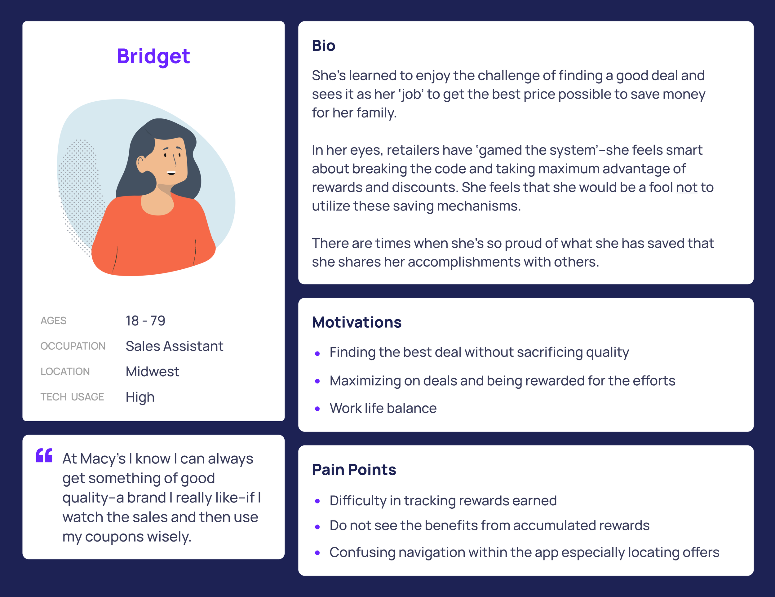
Based on these insights, we identified three core user types the product aimed to support, and chose to focus on the persona, Bridget, who best embodied the shared needs, behaviors, and motivations across all three.
Reimagining the Home Screen Experience
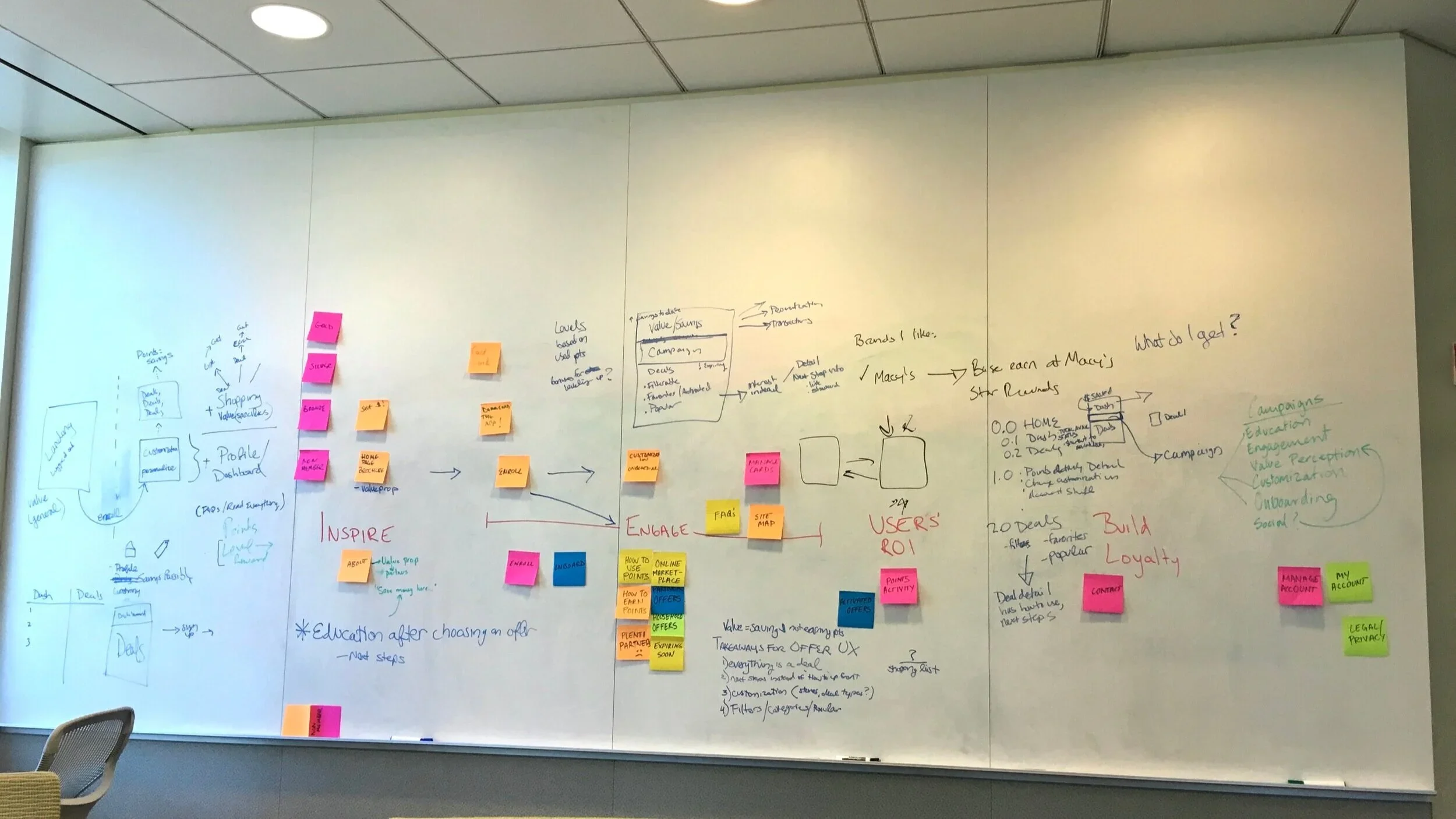
Guided by past usability research and the primary persona, I led a design studio to rapidly explore and align on clearer ways to surface reward points and offers. Using low-fidelity wireframes, we pressure-tested concepts through quick usability sessions with employees outside the Plenti team to validate clarity and signal. Because Plenti’s success depends on customers actively earning and redeeming rewards, the home screen, our highest-traffic entry point, needed to do more than drive offer activation. The objective was to make progress immediately visible, reinforce value, and move customers from awareness to action.
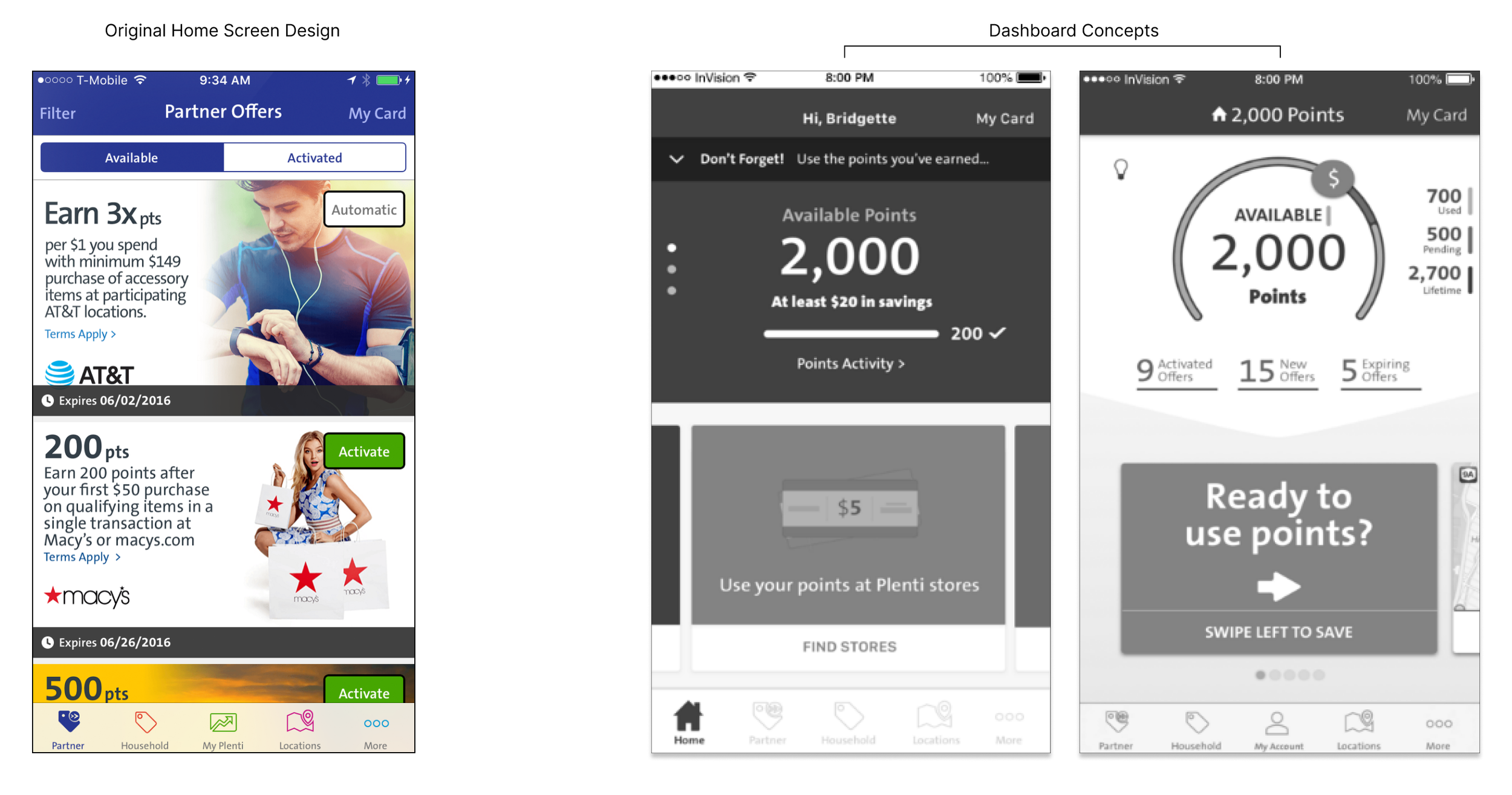
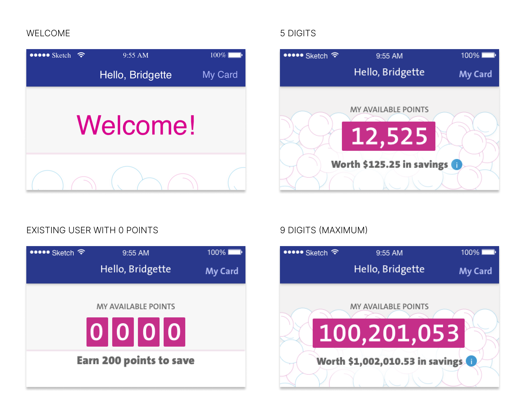
Simplifying the Display of Reward Points
Users primarily logged into Plenti to check their point balance, yet that information was buried in navigation. Surfacing points upfront increased motivation, but testing revealed a clear gap: users needed immediate point-to-dollar clarity to understand real value and take action.
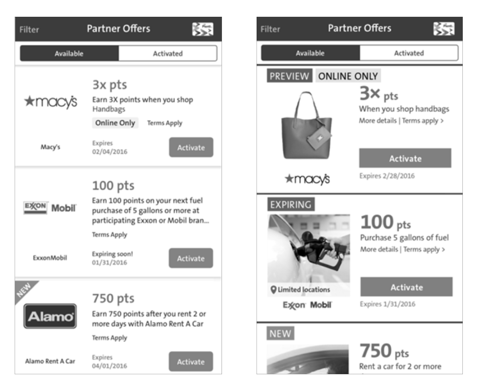
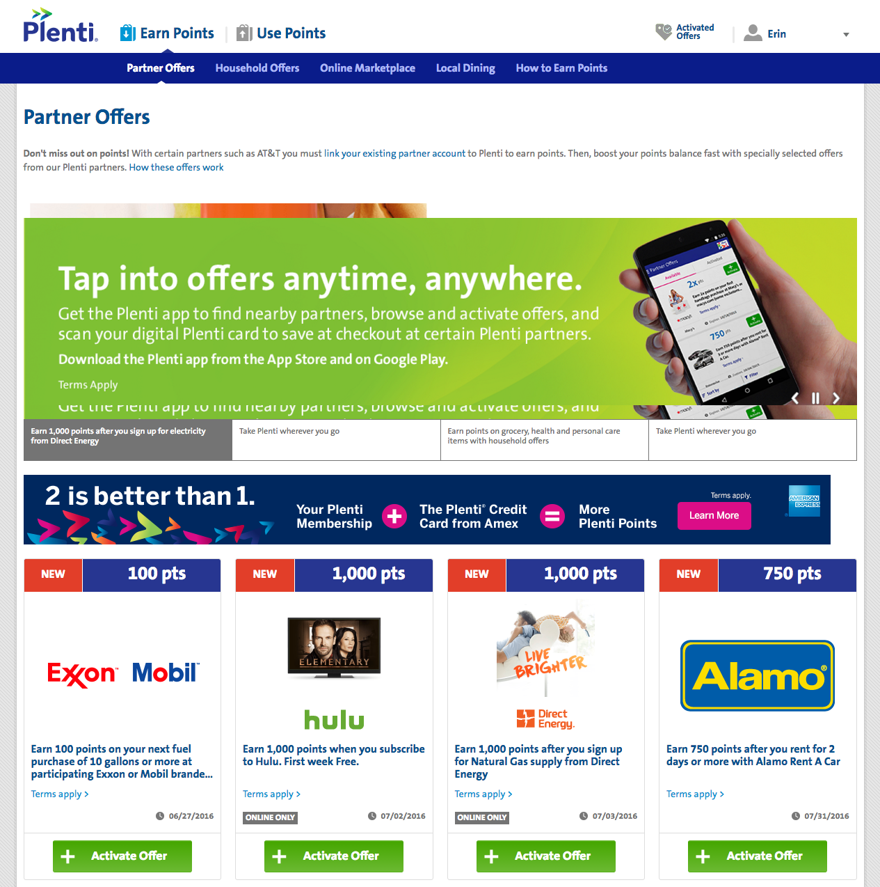
Reshaping the Hierarchy of Information
Users prioritized brand and point value when browsing offers, but dense, unfocused tiles led to disengagement. I restructured the offer tiles around user priorities, simplifying content and clarifying the hierarchy in partnership with the content team. Testing confirmed the redesign improved scannability, focus, and overall engagement.
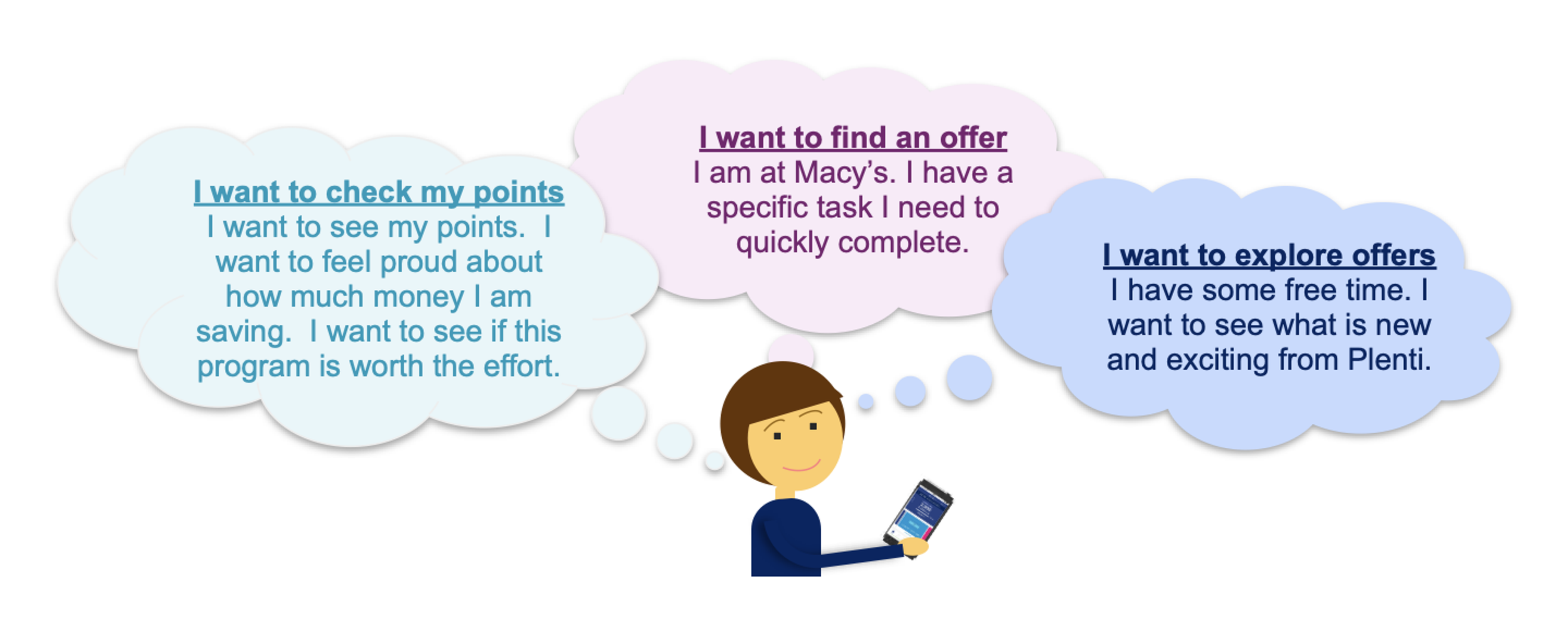
Overall, users responded positively to the idea of a dashboard in the Plenti app, valuing its ability to quickly support their most important tasks:
Primary user goals:
Check Plenti point balance
Find and explore relevant offers
However, feedback also highlighted clear opportunities to make the dashboard more user-centered:
Key improvement areas:
Visual design and content should better reflect memebers’ use cases and emotional motivations
Labels and messaging should consistently prioritize user language over Plenti-centric terminology
Affinity Mapping and Iterations
From the testing, we gathered qualitative feedback by evaluating early design concepts and identifying patterns across user goals and pain points. We then synthesized these insights through affinity mapping to surface key themes and guide design decisions.
Based on the results, I continued to iterate on my designs with the team for the next 3 weeks and we made 3 major improvements:
Meter Design
Based on user feedback, clarity around reward value was critical. Users needed to quickly see both their point balance and its real dollar value. The meter surfaces totals upfront with a clear conversion to eliminate guesswork and shifts from segmented units to a solid bar at higher balances to preserve legibility as totals grow.
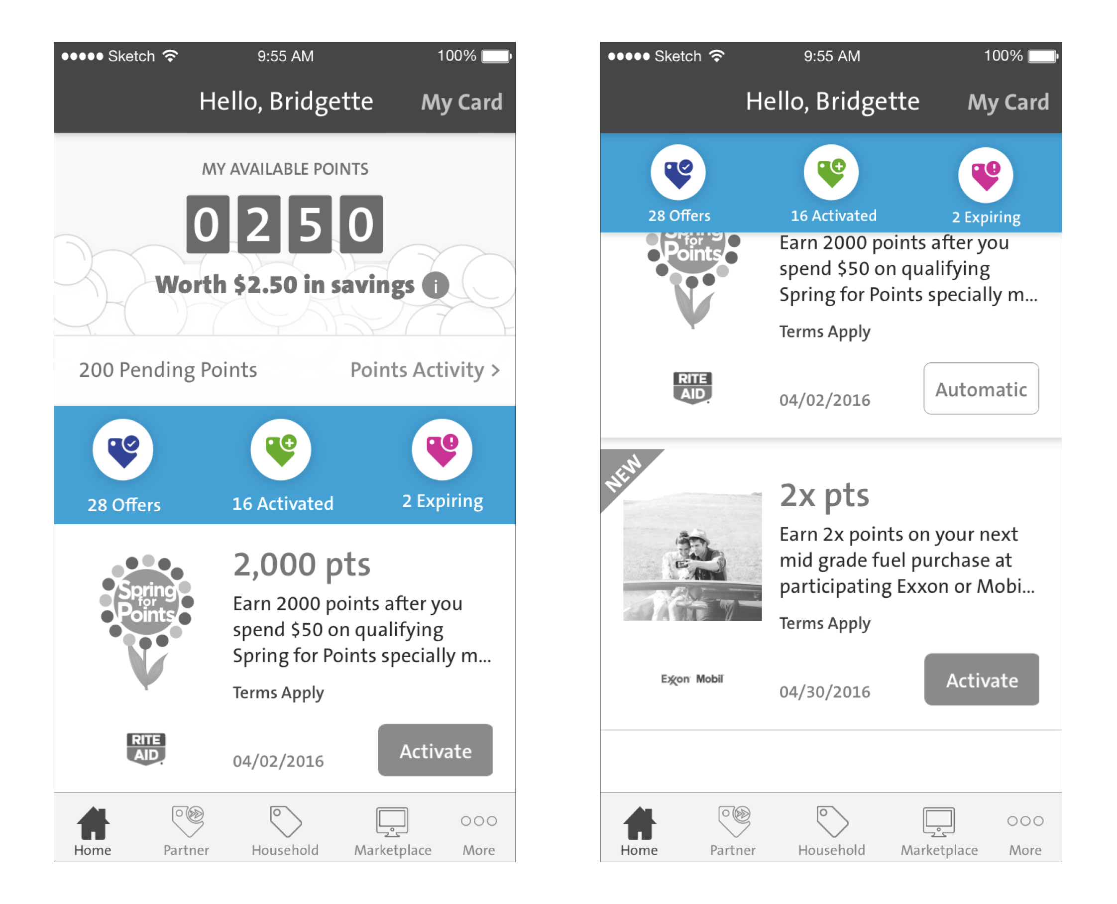
Dedicated Offers Section
In the original design, activated offers were saved under the “Activated” tab, but the placement was unintuitive and often overlooked. User feedback revealed a need for clearer organization to help members manage saved offers more effectively. Introducing a dedicated Offers section made saved offers easy to find and added visibility into upcoming expirations, prompting timely action and increasing offer usage.

Dynamic Offer Tile
Usability testing informed a reordering of the offer tile hierarchy to prioritize point value, the primary motivator for saving and using offers. Upon activation, a dynamic animation confirms the action and moves the offer into the Activated section, creating a clear sense of progress and a more rewarding, confidence-building experience.
Final Design
Launch and Impact (Q3 2016)
The redesigned Plenti experience launched in Q3 2016 and helped sustain strong program momentum by making rewards easier to understand and redeem. Following launch, the program continued to scale rapidly, reinforcing the value of clearer reward visibility and offer engagement.
36M
Within six months since launch, Plenti attracted ~36 million active members, demonstrating strong initial adoption for its coalition loyalty model
60%
Increase in new member registrations as users better understood the value of joining